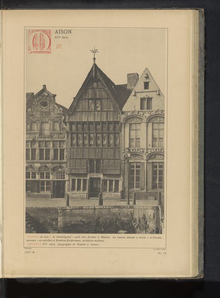
drawing, print, etching, paper, ink
#
drawing
#
16_19th-century
#
dutch-golden-age
# print
#
etching
#
paper
#
ink
#
cityscape
#
realism
#
building
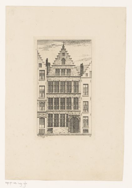
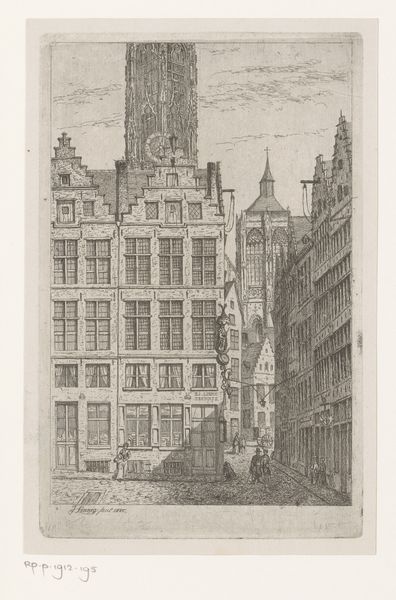
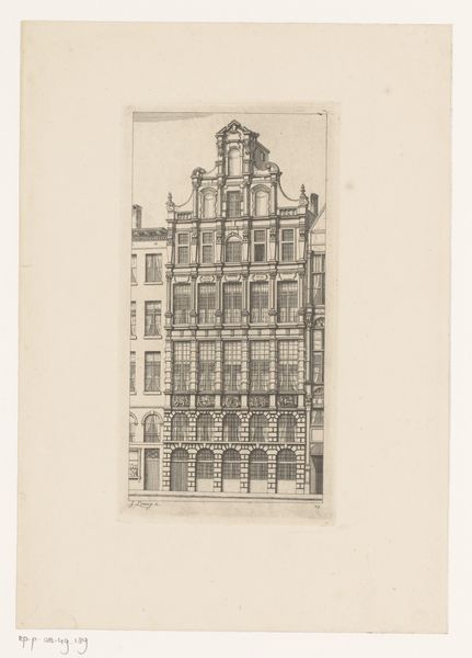
Dimensions: height 191 mm, width 123 mm
Copyright: Rijks Museum: Open Domain
Editor: This is Jean Théodore Joseph Linnig's "Gildehuis van het schippersgilde van Antwerpen," an etching made in 1868. It has such a graphic quality, with incredible precision in the lines. What catches your eye, as a specialist? Curator: The geometric arrangement, above all. Note the emphatic horizontality established by the building's successive registers and how it is counterpointed by the strong verticality of the window placements and the central doorway. Editor: How does that tension between the horizontal and vertical impact your reading of the piece? Curator: It establishes a visual rhythm, doesn’t it? A regulated structure that speaks to the nature of civic architecture of the period, communicating solidity and order. And what of the varying tonal registers of the work? Where do you see the darkest areas and how do they influence the composition? Editor: Well, the darkest areas seem to frame the lighter sections. The shadows really make the windows pop. Curator: Precisely. It guides the eye across the surface, animating the architectural façade through the skillful use of light and shadow. Consider, too, the density of lines, a technical feat that contributes to its visual weight. This treatment imbues the print with a sense of material presence. Editor: It's like the lines themselves become the bricks and mortar. I'm looking at the print in a completely new way now. Curator: By attending to its formal properties—its lines, its balance, and its tonal range—we gain a fuller appreciation of the work's internal coherence.
Comments
No comments
Be the first to comment and join the conversation on the ultimate creative platform.
More like this