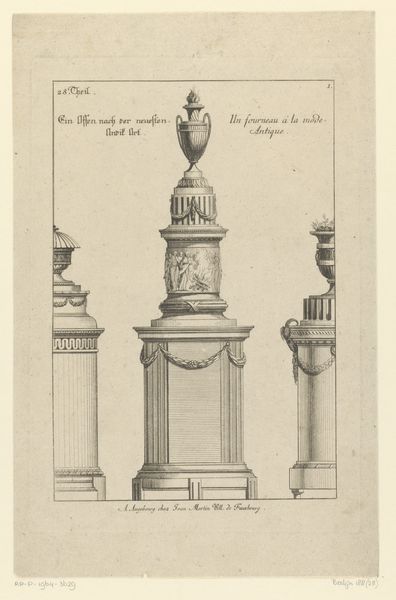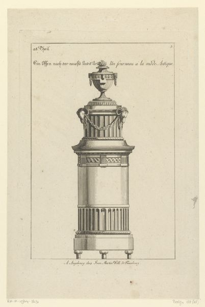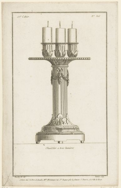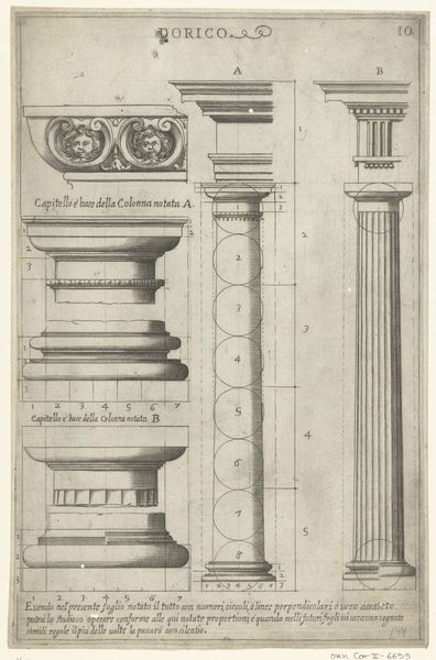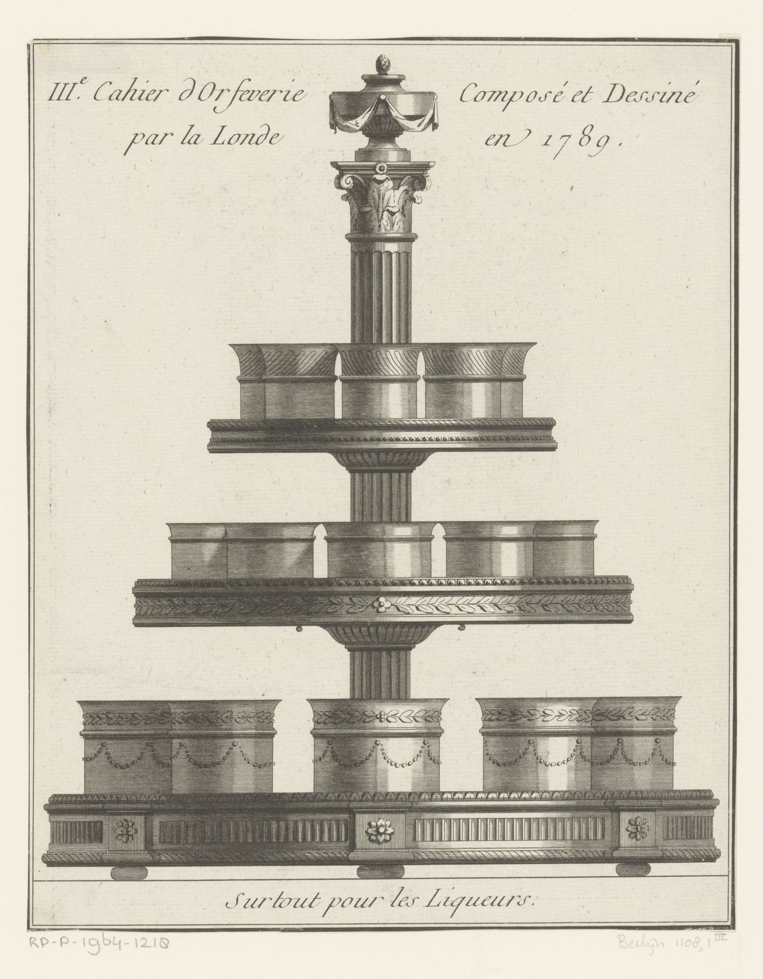
1789
Tafelset voor likeur
de Saint-Morien
@desaintmorienLocation
RijksmuseumListen to curator's interpretation
Curatorial notes
Curator: So, here we have "Tafelset voor likeur" a design for a liqueur set from 1789 by de Saint-Morien. It’s a neoclassical engraving. What strikes you about it? Editor: It feels incredibly formal, even a little austere. It’s so symmetrical, and everything seems to be carefully measured and perfectly placed. What do you see in it? Curator: You nailed it. There's a formality, an almost architectural quality to this design. This piece makes me think of social rituals – the carefully orchestrated performances of high society. Editor: Performances? Curator: I'm wondering, did people actually *use* things like this, or was it more about displaying status and refinement? The Neoclassical style often harks back to a glorified, somewhat sanitized version of the past. Almost as if it existed only in someone's nostalgic dream. It asks us, in some ways, to forget where we came from... but also reminds us that forgetting isn't an option. Do you feel that way too? Editor: I see what you mean! It's definitely less about function and more about sending a message of control and taste. Curator: Absolutely. But taste can be oppressive, don’t you think? All those tiny cups… imagine cleaning them! Editor: Haha, hadn't thought about that. Curator: Maybe the real art isn’t the piece itself, but dodging the duty of scrubbing it after the party is done! What do you think you'll take away from seeing this work? Editor: I’ll never look at a liqueur set the same way! Curator: Hopefully this sparks even deeper pondering on your journey!