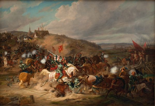
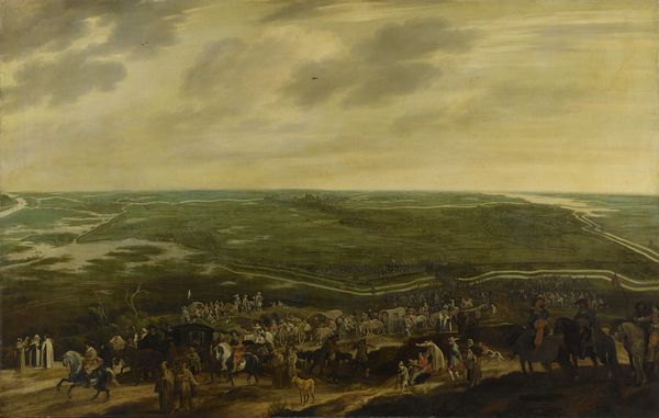
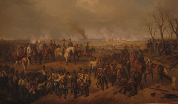
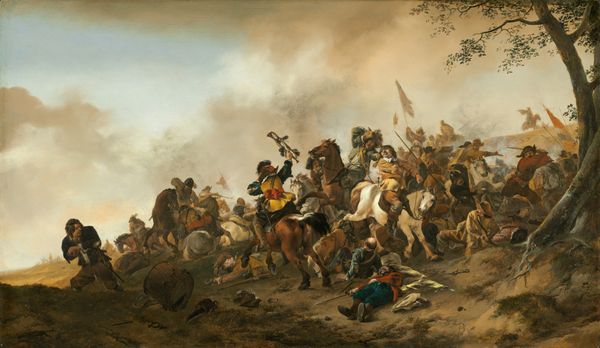
Prince Maurice at the Battle of Nieuwpoort, 2 July 1600 c. 1632 - 1640
0:00
0:00
pauwelsvanhillegaert
Rijksmuseum
painting, oil-paint
#
baroque
#
painting
#
oil-paint
#
landscape
#
figuration
#
oil painting
#
genre-painting
#
history-painting
Dimensions: support height 80.9 cm, support width 116.6 cm, outer size depth 3.5 cm
Copyright: Rijks Museum: Open Domain
Editor: So here we have Pauwels van Hillegaert's "Prince Maurice at the Battle of Nieuwpoort, 2 July 1600", an oil painting made sometime between 1632 and 1640. It looks to me like chaos and strategy all at once, a bird’s-eye view of violence rendered in soft light. How would you interpret this work? Curator: From a materialist perspective, I'm interested in the labour involved in producing a scene like this. Think about the pigments themselves—where did they come from, who ground them, what was the social status of the workshops producing art for wealthy patrons versus the rank-and-file soldiers depicted here? What does the scale of the canvas tell us about Hillegaert's access to resources and his patron’s desires? Editor: That's a really interesting point. I was so focused on the artistic skill and composition that I hadn't considered the, well, manufacturing process. Does focusing on those elements change how we understand the narrative of the painting itself? Curator: Absolutely. Consider the material cost of depicting such a grand scene. Was this about historical record, or self-aggrandizement by association for Prince Maurice? How does this glorification connect to the very real suffering of the lower classes, who likely never saw paintings like these except perhaps hanging in some nobleman’s gallery after contributing labor for taxes to fund that same lord’s lavish lifestyle? This art functions as a sort of historical record but serves particular class interests. Editor: That makes so much sense. Seeing it as an item of luxury made with specific intention for a particular audience gives new depth. Curator: Exactly. Thinking through the labour, resources, and context reveals much about the societal structures in play. What do you make of its use of such earthly colors like tans and umbers when there were options available for much brighter coloring? Editor: The materials feel almost as subdued as the landscape, hiding what it means to portray something terrible by covering up what really makes this a story. I will remember to look for not only the skill of the artist but how things were made going forward.
Comments
No comments
Be the first to comment and join the conversation on the ultimate creative platform.
More like this