print, typography, poster
#
portrait
#
art-nouveau
#
hand-lettering
# print
#
typeface
#
hand drawn type
#
hand lettering
#
typography
#
stylized text
#
thick font
#
typography style
#
handwritten font
#
poster
#
historical font
#
columned text
Copyright: Public Domain: Artvee
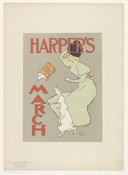
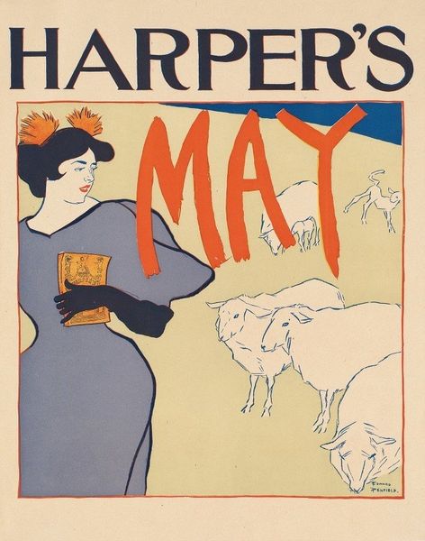
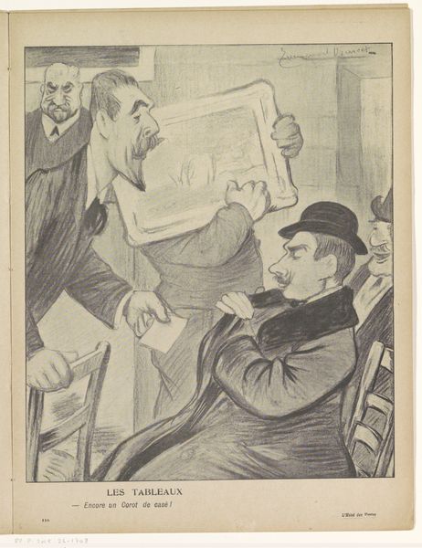
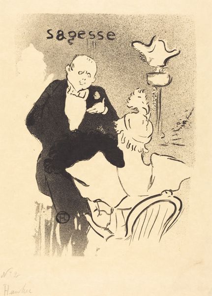
Editor: So, this is "English Society," a poster designed by Edward Penfield in 1897. It looks like a print, with stark contrasts of black and cream. There’s a definite Art Nouveau feel. I'm struck by how much the text dominates—it's almost like a character in itself! What catches your eye about it? Curator: Well, doesn't it just reek of a bygone era? It's more than just a poster; it’s a portal. The subject, perhaps Mr. Du Maurier himself, cradling that terrier like a prized possession, alongside that almost aggressively bold typography. It’s shouting 'English Society' at us! It whispers of drawing rooms, witty banter, and societal expectations so thick you could spread them on toast. Notice how the dog almost mirrors Du Maurier’s quizzical expression, and the slight curve of the spine. Are we peering into the soul of propriety here? Editor: The dog *is* rather astute-looking! I guess I was too focused on the hand-lettering. Curator: Ah, but isn't that the trick of great design? To pull you in with one flourish while subtly laying snares for the imagination elsewhere. Look at that ampersand between ‘Harper’ and ‘Brothers’ – a swooping bird in flight, against the solid blocky font everywhere else. And do you think that carefully considered composition says more about George Du Maurier, the writer, or the society that consumed him? Is it a celebration or gentle satire, do you think? Editor: That’s a really interesting question! I hadn't thought about it being satirical. Maybe a little bit of both? Thanks; I'm seeing way more than I did at first. Curator: Isn't that the joy of art, though? A continuous unveiling, where our perceptions shift and shimmer like light on water.
Comments
No comments
Be the first to comment and join the conversation on the ultimate creative platform.
More like this