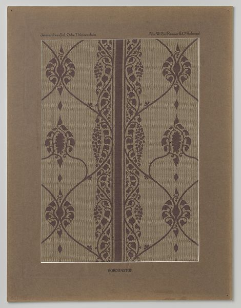
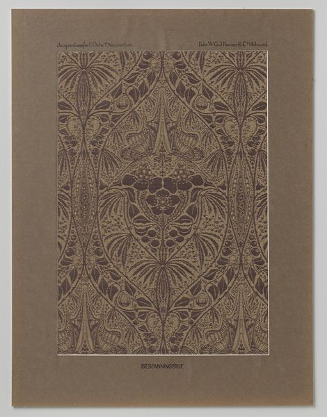
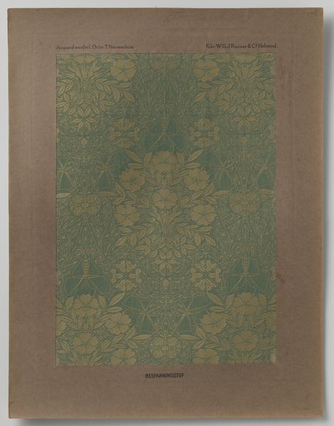
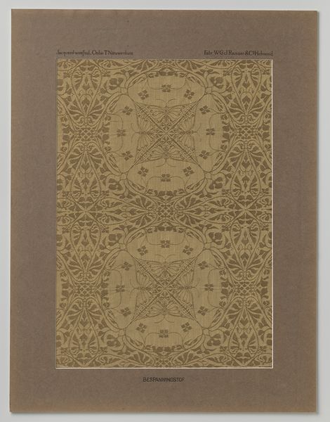
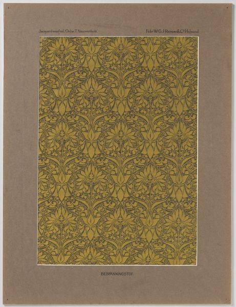
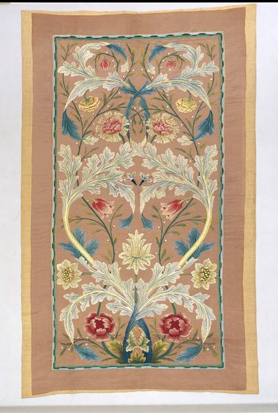
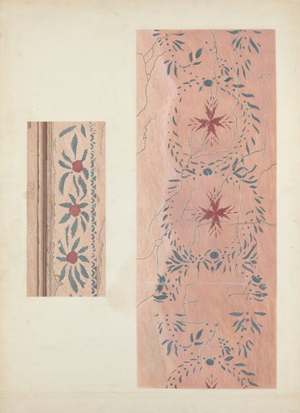
Staal gordijnstof naar ontwerp van Theo Nieuwenhuis in passe-partout c. 1910
0:00
0:00
theonieuwenhuis
Rijksmuseum
print, textile
#
art-nouveau
# print
#
textile
Dimensions: height 64.0 cm, width 49.5 cm
Copyright: Rijks Museum: Open Domain
Editor: Here we have Theo Nieuwenhuis’s “Staal gordijnstof naar ontwerp van Theo Nieuwenhuis in passe-partout” from around 1910, a mixed-media piece featuring textile and print work. It has such a calm, repeating pattern, but what strikes you most about this particular textile design? Curator: The dominance of line and the interplay between figure and ground are paramount. Consider the arabesque tendrils that frame the central floral motifs: the dynamism they create contrasts beautifully with the relative stasis of the magnolia blossoms. Do you perceive a tension arising from this contrast? Editor: I see what you mean! The frame is very active while the magnolias are static. How do the colors play into this overall composition? Curator: The limited palette, primarily earth tones, focuses our attention on the formal relationships rather than relying on vibrant color to create interest. The slight variations in shade delineate the different planes and textures within the work itself. One might even say the lack of a dynamic color scheme draws more attention to the patterns. Editor: That's an interesting point – so, the muted colors actually amplify the forms! I guess I always assumed more color meant more visual interest. Curator: Precisely! This design compels us to appreciate the subtle nuances of texture, line, and form above all else. Did you notice the implied vertical movement in the central panels of the frame and in the progression of magnolias? Editor: Now that you point it out, I do. This was enlightening; I'm beginning to look at textile design in a totally different light now! Curator: Indeed, the piece offers a lesson in restraint and the power of pure form, drawing your attention to its beautiful symmetries.
Comments
No comments
Be the first to comment and join the conversation on the ultimate creative platform.
More like this