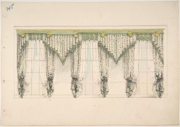
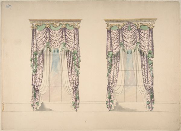
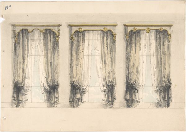
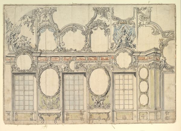
Design for Green and White Curtains with Green Fringes and a Green and Gold Pediment 1800 - 1850
0:00
0:00
drawing, print
#
simple decoration style
#
photo of handprinted image
#
drawing
#
toned paper
#
water colours
#
pastel soft colours
#
ink paper printed
# print
#
stoneware
#
watercolour bleed
#
watercolour illustration
#
watercolor
Dimensions: sheet: 8 5/8 x 12 5/16 in. (21.9 x 31.2 cm)
Copyright: Public Domain
Editor: Here we have a "Design for Green and White Curtains with Green Fringes and a Green and Gold Pediment," created sometime between 1800 and 1850. It’s an anonymous work, using drawing and printmaking techniques, including watercolor, ink, and pastel. It strikes me as a rather opulent, though ultimately unrealized, vision for interior decor. What are your thoughts when you see this piece? Curator: This watercolor offers us a glimpse into the world of 19th-century domestic ideals and the burgeoning culture of interior design. Consider how something like this would have circulated. Was this intended for a specific client, or was it perhaps part of a pattern book meant to influence wider tastes? The level of detail suggests an intention beyond a simple sketch, doesn't it? Editor: Definitely, the details in the fringe and the pediment feel quite deliberate. So, thinking about wider tastes, who would have been commissioning something like this? Curator: It’s likely a reflection of the aspirations of the burgeoning middle class, seeking to emulate aristocratic elegance but also, perhaps, to express their own unique identities through carefully curated domestic spaces. We can also read this through the lens of the emerging professional designer, who acts as an arbiter of taste and helps to shape these aspirations. Does the uniformity of the three window treatments suggest anything to you? Editor: I think it underscores the increasing standardization of taste at the time. It makes me think about how mass production, even indirectly, was impacting even supposedly unique spaces. Curator: Precisely. Even the desire for unique self-expression becomes, ironically, subject to market forces and prevailing social trends. Thinking about the Metropolitan Museum owning the artwork: how might this setting affect the reception of this piece versus if it were, say, in a design archive? Editor: Good question. Being in the Met elevates it to a fine art status that maybe wasn’t originally intended. We start analyzing it for artistic merit instead of its original function as a design proposal. Curator: Exactly! It encourages us to see how museums themselves construct and shape the narrative around even the most seemingly straightforward image. That's definitely food for thought. Editor: Absolutely. I will never look at a design drawing the same way! Thanks!
Comments
No comments
Be the first to comment and join the conversation on the ultimate creative platform.
More like this