drawing, ink
#
drawing
#
ink drawing
#
landscape
#
ink
#
cityscape
#
modernism
#
realism
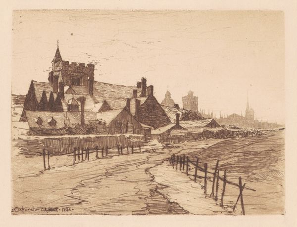
Dimensions: height 148 mm, width 206 mm
Copyright: Rijks Museum: Open Domain
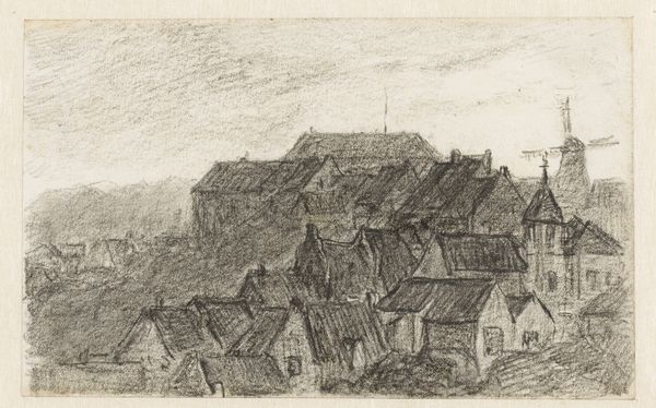
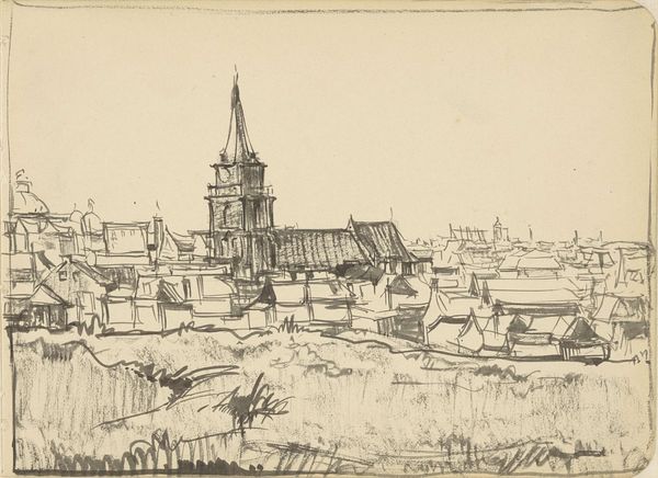
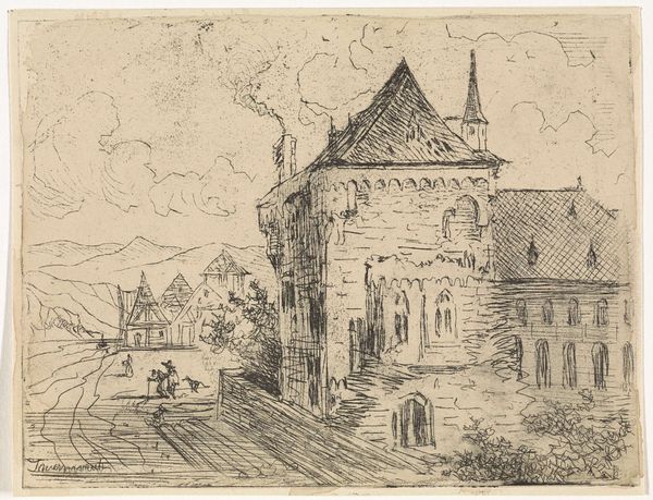
Editor: Here we have Dick Ket’s 1924 ink drawing, "Gezicht op huizen en kerk in Scheveningen," currently residing at the Rijksmuseum. The heavy use of ink makes it feel a bit claustrophobic and dense, despite being a landscape. How do you interpret this work? Curator: Let us focus first on the interplay of lines. Notice the artist's technique: a rapid, almost frenetic application of ink to describe form. Observe the structural relationships between the buildings, how the varying densities of linework suggest depth, although without conforming to traditional perspective. The steeple, centrally placed, becomes the focal point, dominating the composition through its height and the radiating lines describing its structure. Editor: It feels unfinished or perhaps like a sketch for something more. Curator: Precisely, that feeling contributes to its unique aesthetic. Does this sketch-like quality detract or add to its appeal, would you say? Consider how the materiality of the ink on paper contributes to the artwork’s overall effect. Is it merely a depiction, or does the application itself become part of the message? The absence of color amplifies our focus on form and the textures created by the artist's hand. Editor: It seems the raw energy of the lines adds an honesty to the work, foregoing the perfection of realism for something more immediate. It's almost like a captured feeling of the place, not just a rendering. Curator: Exactly! This observation speaks volumes. Ultimately, how do you view Ket's success in harnessing such rudimentary means to express the complexity of place? Editor: I now appreciate how the technique serves to distill the essence of the town, perhaps prioritizing feeling and structure over pure representation. It gives an immediacy and depth I initially missed. Curator: A fitting summation. Paying close attention to these intrinsic visual elements opens up layers of interpretation, doesn’t it?
Comments
No comments
Be the first to comment and join the conversation on the ultimate creative platform.
More like this