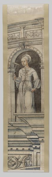
print, woodcut
#
art-nouveau
# print
#
figuration
#
geometric
#
woodcut
#
line
Dimensions: height 187 mm, width 79 mm
Copyright: Rijks Museum: Open Domain
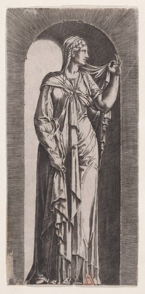
Curator: Immediately striking is this somber mood and stark geometric patterning. There's a gravity to this figure, wouldn't you agree? Editor: It's quite a curious artwork, especially when we consider the historical context. This is "Athiom of A," a woodcut print created around 1895 by the Dutch artist Karel Petrus Cornelis de Bazel. It has distinct Art Nouveau qualities. Curator: The Art Nouveau influence is clear. Considering that it's a print, I'm really drawn to the meticulous carving; it's an amazing technical feat. Think about the process and time commitment inherent in executing those dense fields of dark and light. Editor: I am equally interested in the Egyptian Revival influence in De Bazel's "Athiom." This orientalizing fantasy needs to be situated in late 19th-century imperial history; it is impossible to separate aesthetic preference from colonial appropriation at this moment in European visual culture. Curator: An interesting observation. I suppose you're suggesting this fascination with the "Orient" says as much about Europe's vision of itself as it does about, say, Ancient Egypt. But doesn't the focus on the linear elements distract from some of that potential cultural appropriation you're calling out? Editor: Yes, exactly. And in addition to Europe's imagined "Orient," De Bazel is very clearly engaging fin-de-siècle concepts about gender, identity, and the exotic. That is an interesting point about line. Even the apparent clarity is unstable; consider her pose, her costume, even the magical items on her altar. They're signifiers—but of what exactly? Curator: Perhaps the “what” matters less than the act of signifying itself, drawing attention to labor that goes into the aesthetic project? In this particular scene it also makes me think about production costs: was the image created in large quantities? For commercial purposes? And to whom was it marketed, or meant to appeal? Editor: Those are fascinating material concerns, and a potent reminder to critically re-examine presumed notions of beauty that often function as barriers to a deeper understanding of the intersectional narratives woven within this era's production. Curator: Very well said. There is certainly a lot here to consider, and for me, the sheer materiality of the work adds weight to that message. Editor: Indeed. Between production, appropriation, gender and power, there are a multitude of ways to look at this complex print.
Comments
No comments
Be the first to comment and join the conversation on the ultimate creative platform.
More like this