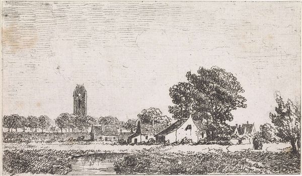
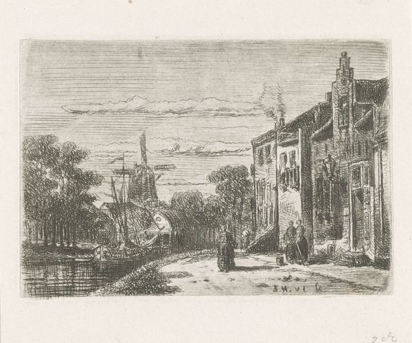
drawing, paper, ink
#
drawing
#
pencil sketch
#
landscape
#
paper
#
ink
#
cityscape
#
street
#
realism
#
building
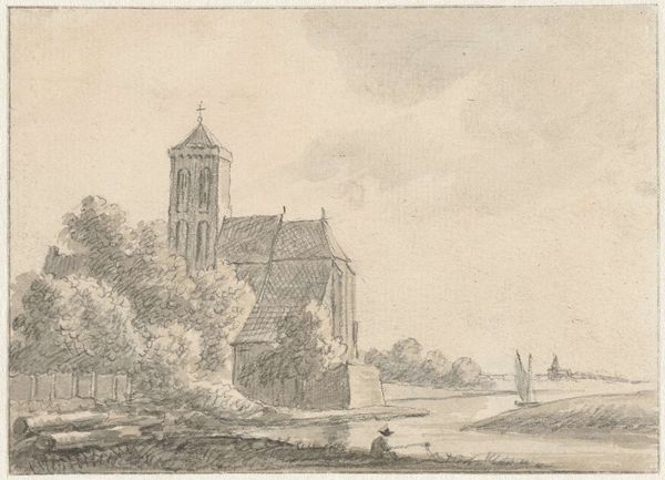
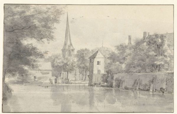
Dimensions: height 142 mm, width 194 mm
Copyright: Rijks Museum: Open Domain
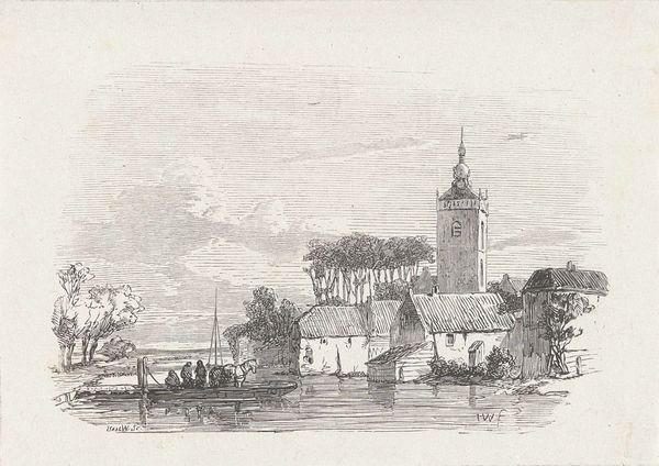
Editor: So this is "Gracht in een stad met een kerktoren", a drawing by Isaac Weissenbruch, likely made between 1836 and 1912. The materials listed are ink and pencil on paper. It looks so detailed, like a photograph almost, even though it's a sketch. What strikes you about the composition? Curator: The compelling element here is Weissenbruch's orchestration of light and shadow. Notice the sharp contrast used to define the architectural forms and the water's edge. How does this contrast affect the viewer's perception of space within the composition? Editor: I see what you mean, it creates depth. The dark lines of the buildings on the left really make them pop against the sky. What about the texture? Curator: Precisely. The artist’s distinct marks evoke varied textures - from the roughness of the brick to the placid surface of the canal, but also, and more importantly, to build an organized surface in which no single part outshines any other. Is there an evenness to the construction, a balancing of formal relationships between masses and lines. Editor: I agree! Is that why the tower in the back doesn’t dominate? Curator: Exactly! Weissenbruch is demonstrating mastery through a strategic selection of perspectival structures. Through that selection, the work showcases his understanding and purposeful arrangement of formal elements, showcasing a commitment to technical proficiency, artistic expression, and control. Editor: I hadn't considered the perspective in that way, more than just accurate, a tool to balance the piece. Thanks! Curator: Indeed. Analyzing art from a formalist perspective opens avenues to appreciate its visual language beyond mere representation.
Comments
No comments
Be the first to comment and join the conversation on the ultimate creative platform.
More like this