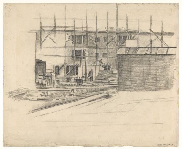
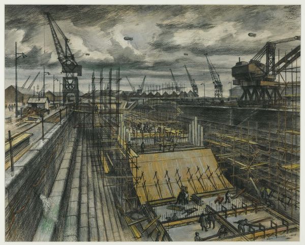
drawing, coloured-pencil, paper, architecture
#
drawing
#
coloured-pencil
#
landscape
#
paper
#
coloured pencil
#
modernism
#
architecture
#
realism
Copyright: Public Domain
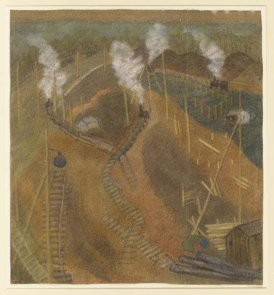
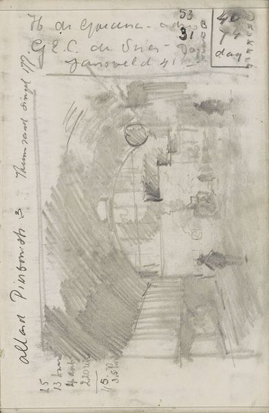
Editor: Here we have Pauline Kowarzik's "Building site of I. G. Farben," created in 1929 using colored pencils on paper. The scaffolding dominates the composition. It is an interesting juxtaposition of industry and landscape, but I'm not sure what to make of it. How do you interpret this work? Curator: My focus immediately turns to the interplay between line and volume. Observe how the scaffolding is meticulously rendered with crisp, definitive lines, creating a complex network of geometric shapes. This rigid structure contrasts sharply with the softer, almost hazy rendering of the sky and surrounding landscape. Editor: Yes, I see that now. It’s a powerful contrast! The rigidity of the structure and then the almost smoky sky. Curator: Indeed. Consider the artist's choice of medium. The coloured pencils allow for precise detail, evident in the building’s framework, but also facilitate the subtle gradations of color in the sky. What effect does the restricted palette achieve in your opinion? Editor: I guess it creates a muted atmosphere, almost dreamlike. Curator: Precisely. The limited color range creates a sense of unity, harmonizing the industrial subject with the natural world. Notice the figures on top, dwarfed by the steel structure. What does that signify in your perspective? Editor: Humbling! So the artist juxtaposes industry with nature while contrasting humans. Curator: You summarize elegantly! It becomes clear the drawing is more about how forms interrelate than a pure representation of industry and construction. I shall keep this in mind for my future viewings. Thank you for pointing out some exciting viewpoints in Kowarzik’s artwork!
Comments
No comments
Be the first to comment and join the conversation on the ultimate creative platform.
More like this