drawing, print, metal, intaglio, engraving
#
drawing
# print
#
metal
#
intaglio
#
old engraving style
#
form
#
11_renaissance
#
geometric
#
line
#
northern-renaissance
#
engraving
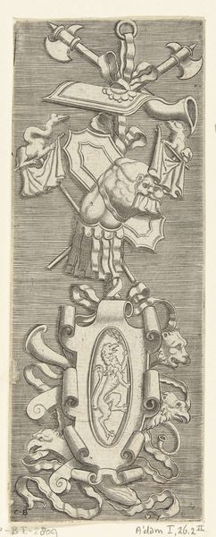
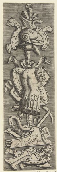
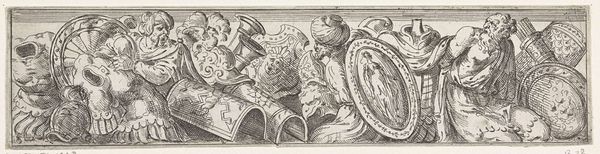
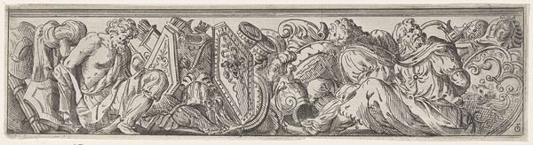
Dimensions: height 161 mm, width 62 mm
Copyright: Rijks Museum: Open Domain
Curator: Here at the Rijksmuseum, we're standing before "Vlakdecoratie met trofee van schilden," an engraving that dates back to the mid-16th century. Though the artist is unknown, this piece offers rich insights into Renaissance aesthetics and heraldry. Editor: Whoa, that’s intricate! It kinda looks like a super elaborate hood ornament for a chariot from outer space, or maybe an alien doorknocker! There are shields and animal heads...the textures make it feel tactile even though it’s an engraving. Curator: The layering of elements is very deliberate, a conscious demonstration of status and power. Shields were visual declarations, often blending family symbols with broader social or political allegiances. Editor: All those weapons too! I mean, you’ve got your standard axe… and a ram’s head perched right at the top. What does it *mean*, beyond "We’re really, really important and should probably be in charge"? Curator: Exactly. The symbols all speak to that message. I mean, heraldry operates as an early system of branding, signifying lineage and establishing social hierarchy. The inclusion of classical motifs signals learning, virtue, and authority by referencing antiquity. It connects families to enduring, historical narratives. Editor: And does the animal mashup—goat-ram-lizard things—add another layer of meaning? Are they linked to families too? Is it meant to scare me, or amuse me? Curator: More likely to inspire awe than pure fear. These creatures, likely rendered through the imaginative freedom afforded in these "grotesque" designs popular at the time, also speak to humanist fascinations. Editor: There’s a weird asymmetry here, too. The shields are deliberately mismatched in size and shape...Is it pushing back at classical ideas of proportion, making it seem less rigid somehow? It’s almost playful, this rejection of order. Curator: That slight imperfection does introduce a touch of dynamism. And it complicates our understanding – showing that power is a messy negotiation of identities. This wasn’t just for display; these objects shaped self-perception. Editor: This artwork, despite its small size, is teeming with so much that reflects identity, not just an artistic choice. This engraving sparks more questions about power dynamics and challenges us to interpret the layers. Curator: Precisely. And as we look again at this elaborate tower of symbols, it pushes us to confront those past assertions of dominance while inspiring critical dialogue about the structures that still echo today.
Comments
No comments
Be the first to comment and join the conversation on the ultimate creative platform.
More like this