Copyright: Public domain
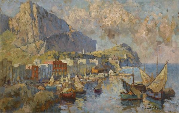
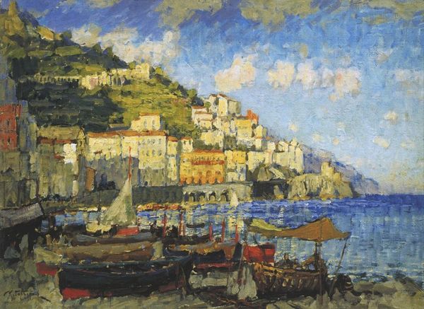
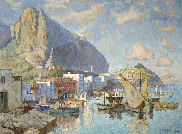
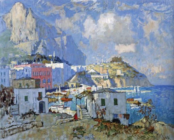
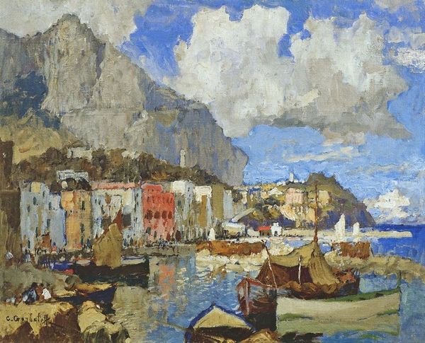
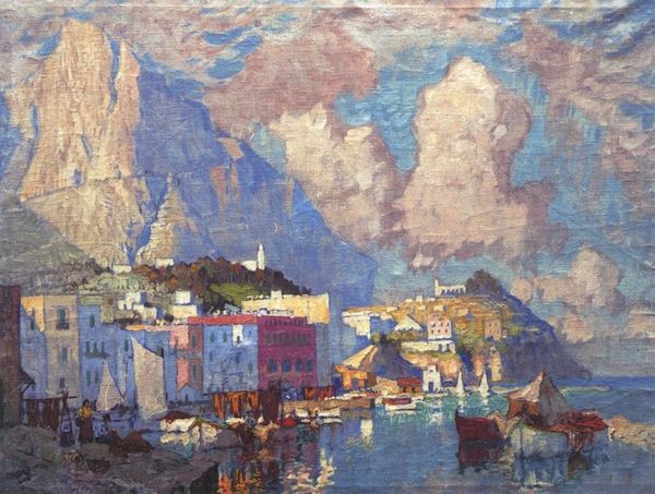
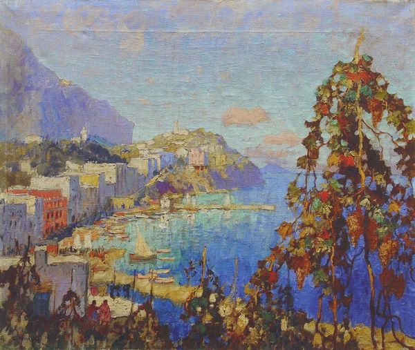
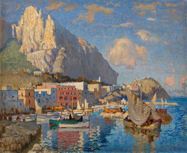
Konstantin Gorbatov made this painting of Scarborough with what looks like oil on canvas. The way the colours are layered here – these brushstrokes of teal and blue, and the way they sit next to the warm reds in the buildings – it’s all so exciting, you get a real sense of place. I always find it fascinating to see how artists use colour to create atmosphere and depth. Up close, you can see these little dabs and dashes of paint, almost like the artist was building up the image piece by piece. The texture gives the whole thing a kind of lively energy. It feels like the artist was really present in the moment, responding to the light, the colours, the feel of the air. And that one spot, right where the sea meets the sky? It feels like the whole painting is breathing around that point. It reminds me a little of Boudin, but with a Russian sensibility. Ultimately, art is an ongoing conversation, and it's never really about having the definitive answer.
Comments
No comments
Be the first to comment and join the conversation on the ultimate creative platform.