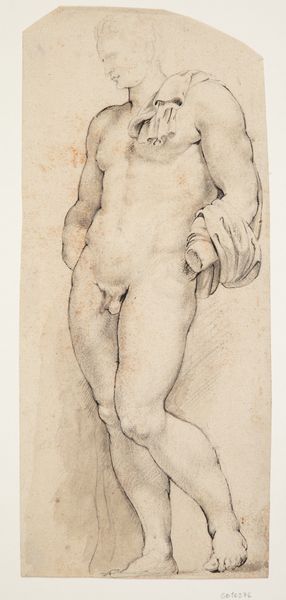
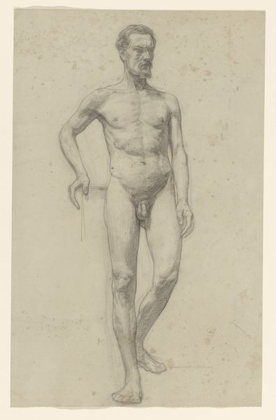
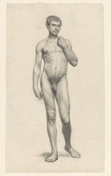
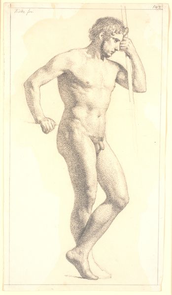
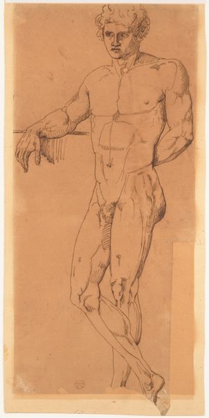
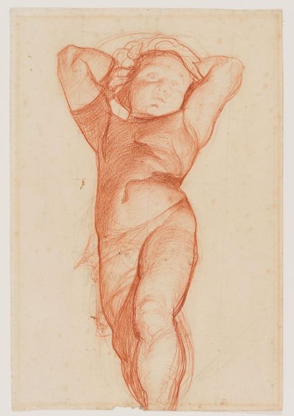
drawing
#
portrait
#
drawing
#
mannerism
#
figuration
#
nude
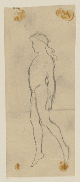
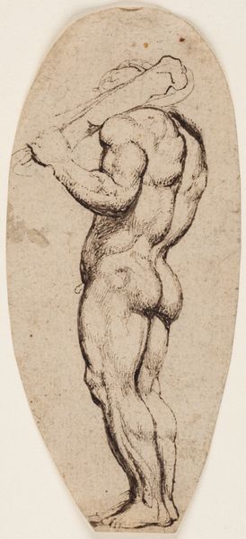
Dimensions: 158 mm (height) x 68 mm (width) (bladmaal)
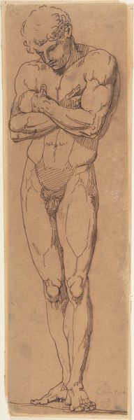
Editor: This drawing, titled "Merkur," was created by Peter Paul Rubens between 1598 and 1609. It's currently housed at the SMK in Copenhagen. The pen strokes create such depth to the figure, though the surrounding composition is strikingly absent. How would you interpret Rubens' work here? Curator: Its Mannerist style emphasizes dynamism and elongated forms. Notice the deliberate asymmetry; one arm extends invitingly, while the other remains close to the body, creating a torsion within the figure. Also consider the graphic impact; line and shade serve less to model and more to denote form through almost abstract patterns. This, rather than a pure representation, is the heart of the drawing. Do you observe how Rubens’ pen work and hatching are used to delineate light? Editor: I see what you mean, particularly in the treatment of the torso, how the lines seem to define form instead of being representational of form itself. It’s interesting that Rubens does not try to realistically render this subject. How does that approach change our understanding? Curator: Precisely. The lack of strong grounding also suggests the Mannerist pursuit of grace over gravity. Its deliberate formal play subverts the classical expectations even as it engages the viewer. Does this reading enrich your view of the drawing now? Editor: It really does. Considering the formal qualities helps shift the focus away from pure depiction and towards Rubens' conscious manipulation of artistic conventions. Curator: Agreed. The aesthetic considerations—the artistic techniques and visual language employed by Rubens—form a powerful interpretive framework for us to really dig into Mannerism. Editor: Thank you; I definitely will not look at this drawing the same way again.
Comments
No comments
Be the first to comment and join the conversation on the ultimate creative platform.
More like this