1911
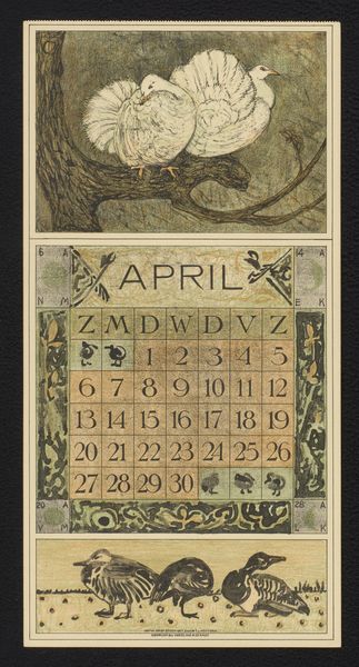
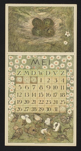
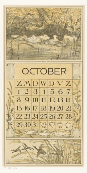
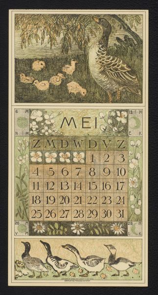
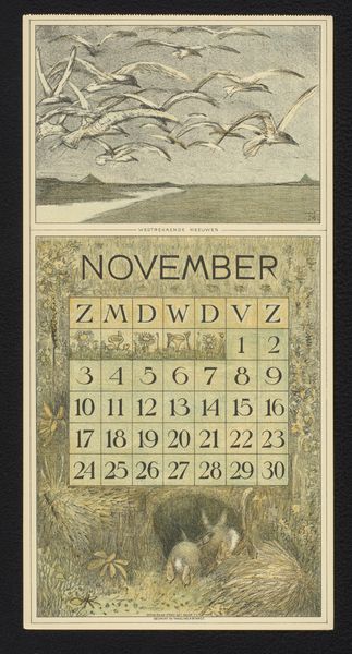
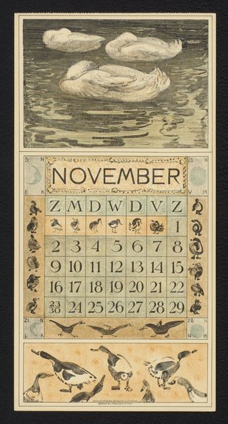
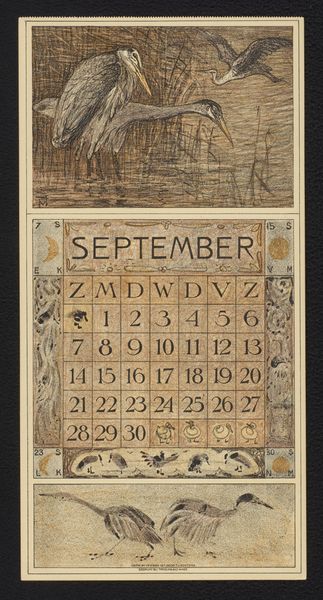
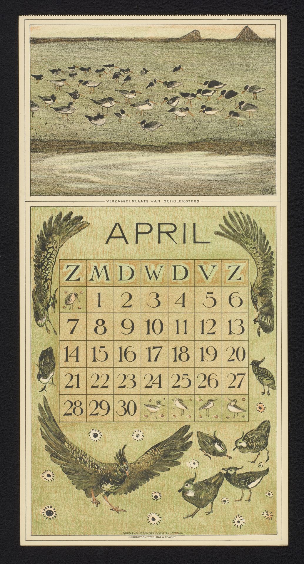
Kalenderblad voor april 1912 met scholeksters en kieviten
Theo van Hoytema
1863 - 1917Location
RijksmuseumListen to curator's interpretation
Curatorial notes
Theo van Hoytema made this calendar page for April 1912 with lithographic ink, and he really lets us see the process. The palette is muted, and it feels like the colours were applied in layers, building up a sense of depth and texture. Look at the gathering of birds at the top. The marks are gestural, almost like shorthand for feathers and movement. It's not about perfect representation, but about capturing the feeling of a flock taking flight. Then, there's the grid of the calendar itself, surrounded by these gorgeous, graphic avian motifs. The way he's used line and tone reminds me of woodcuts. Note how the wings of the birds frame the calendar. It's like they're protecting time, or maybe just reminding us of the fleeting nature of each day. Van Hoytema’s work has echoes of Japanese prints, where nature is rendered with such careful observation and a deep sense of reverence. He invites us to contemplate the passage of time and our connection to the natural world.