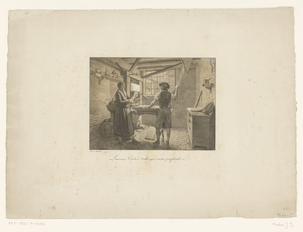
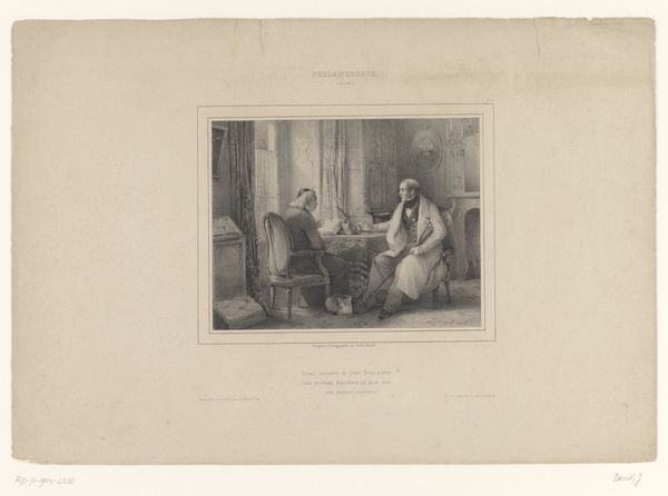
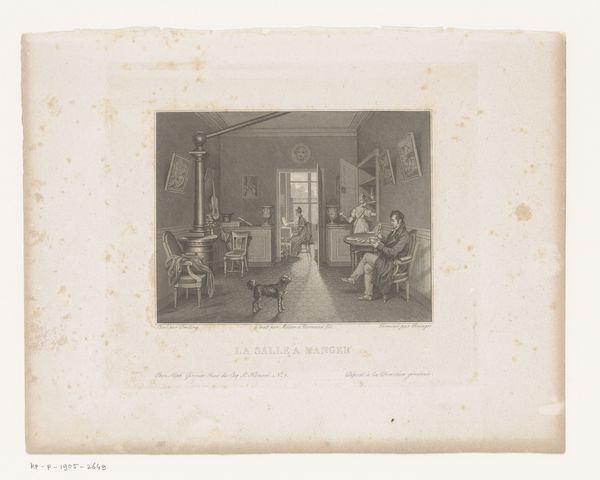
watercolor
#
portrait
#
pastel soft colours
#
muted colour palette
#
figuration
#
watercolor
#
intimism
#
romanticism
#
watercolour illustration
#
genre-painting
#
soft colour palette
#
watercolor
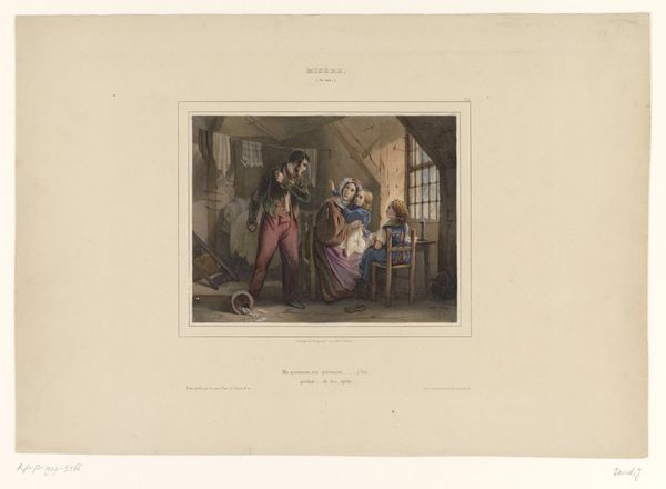
Dimensions: height 310 mm, width 445 mm
Copyright: Rijks Museum: Open Domain
Curator: Let's consider "Drie vrienden vragen een student om mee uit te gaan," created in 1836 by Jules David. The Rijksmuseum is where this particular watercolor is housed. What strikes you first about this scene? Editor: The image, bathed in muted pastel colours, seems to be a melancholic representation of disrupted study. There's an overwhelming feeling of introspection within these lines, primarily concentrated around the student in the center. Curator: I read the scene rather differently, seeing in the interruption and the invitation of the title a reflection of social dynamics. To me, it speaks of the complexities surrounding privilege and opportunity for students. Whose circle are they implicitly invited to join? What might it mean to decline the proposition? Editor: From my point of view, the attire of each of these individuals contains multiple symbolic cues. It's important to think about who the individuals within the painting may symbolize. The student, hunched over and dressed modestly, looks like he has no choice but to focus on his books; his isolation from the rest of society is evident by what he wears, which are common clothes. Now contrast that to the three characters behind him: there's an abundance of class and sophistication in their demeanor. I see class divide represented quite prominently through visual cues. Curator: I agree wholeheartedly. The tophat and finer dress code are undeniably signs of the existing social hierarchy. Furthermore, let's not overlook the composition itself: the positioning of these characters also highlights potential social tension in relation to the social circumstances of students, since in 1836, the opportunity to receive proper formal education may have been barred from numerous groups. I question what is really implied with such imagery. Are these people actual 'friends' or rather a subtle attempt at indoctrination through group acceptance? Editor: Intriguing indeed. If you delve into it, though, it seems that even something seemingly insignificant, such as color use, contains powerful meaning behind its application. Consider that, in general, softer palettes can give the illusion of serenity and calm, whereas harsher colors are perceived more aggressively, due to the heightened visibility caused by this effect within different forms of art overall; this seems purposefully done, in order for them not be seen or remembered easily as much afterwards overall. This further promotes my interpretation in many regards by offering visual context surrounding different emotional responses, based mostly according either positive traits contrasted or compared from differing negatives depending simply regarding perspective changes happening throughout both conscious thoughts influencing overall expression.. Curator: You've added another important layer of interpretation to this, pointing toward muted pastel palettes being something actively considered during planning regarding expression which makes this worthwhile indeed now when understanding different dynamics impacting perspective within such visuals by reflecting how they both shape individual consciousness and thus societal behaviors as a whole! Editor: Thank you—uncovering multiple meanings embedded so cleverly creates another sense surrounding different elements expressed within something. The act adds another exciting meaning, one providing new thoughts by highlighting new concepts introduced within any painting style regardless regarding its application after considering those unique moments surrounding emotional or abstract forms respectively whenever possible!
Comments
No comments
Be the first to comment and join the conversation on the ultimate creative platform.
More like this