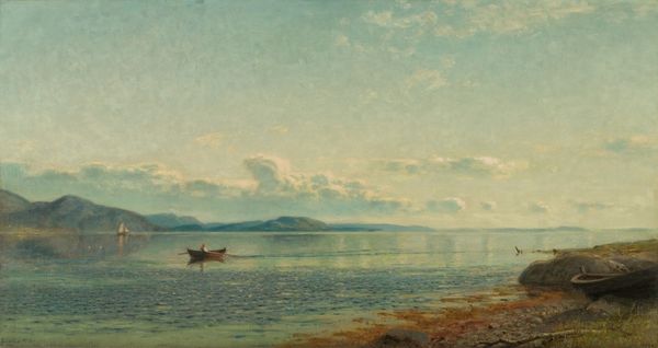
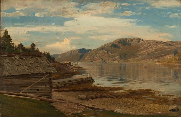
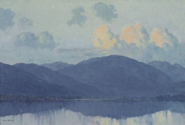
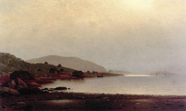
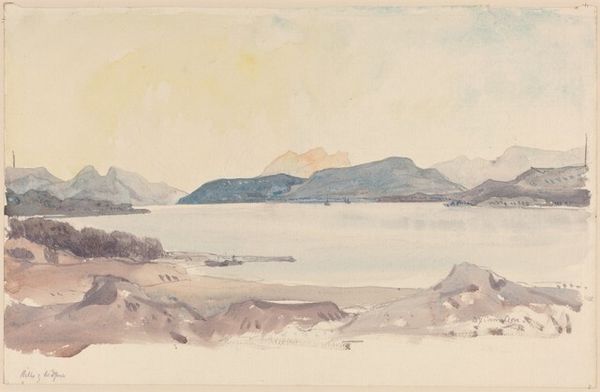
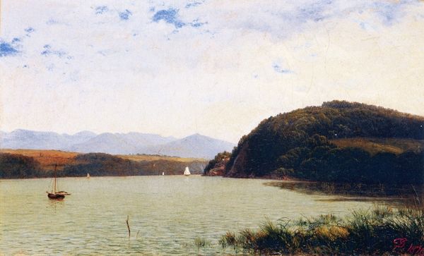
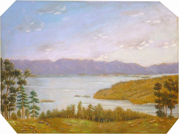
painting, watercolor
#
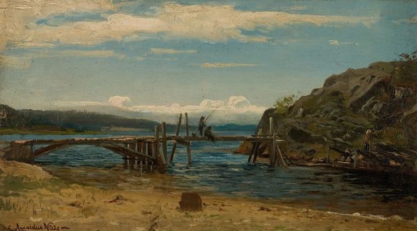
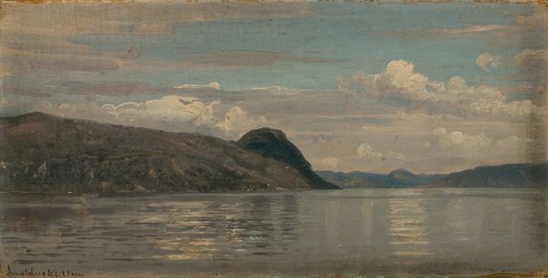
painting
#
impressionism
#
landscape
#
oil painting
#
watercolor
Copyright: Public Domain: Artvee
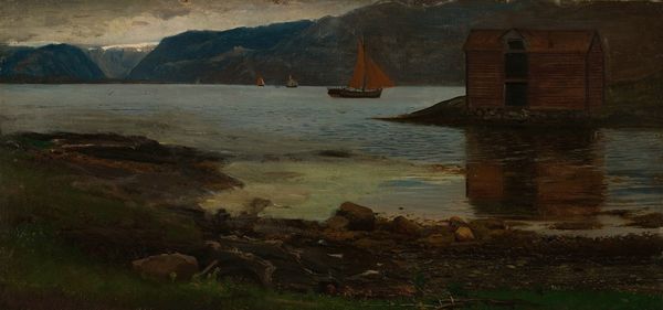
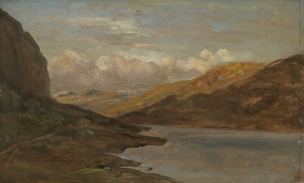
Curator: What a wonderfully evocative piece! The somber palette certainly creates a particular atmosphere. Editor: Indeed. And given the artwork is titled "Utvik, Not a Fjord, Norwegian Trip" from around 1890, I am immediately struck by its subdued tonality. I want to consider how the materials--watercolor and possibly oil, if we look closely at the texture--contribute to this overall feeling. What was available to the artist in terms of pigments at that time, and how does that impact the choices made here? Curator: That's fascinating. We should also think about how a Norwegian landscape, already a site loaded with national and cultural symbolism, might be presented in a way that steers away from the picturesque fjord imagery that was so popular. It presents almost as the opposite, a self conscious attempt at an un-picturesque portrayal. Editor: Precisely. It begs the question: what artistic circles were influencing the hand behind this work? What societal or institutional pressures might have been at play causing him or her to choose the “not a fjord” direction and make it literal in the title. Was it commissioned, or self-initiated? That distinction matters to understand the means of artistic production here. I wonder who was meant to view this art. Curator: Considering how art from that time and place served the purpose of nation-building and the promotion of Norwegian identity, perhaps it was meant to appeal to an audience both within Norway and abroad— to perhaps introduce to a different and nuanced visual presentation of the nation. Or reject it. Editor: To that point, do you think the work then succeeds in complicating that kind of cultural promotion? And given the possible presence of both water and oil color as a sign of resources invested in it, is the picture showing how the romantic ideals might not exist. It becomes not the postcard you'd think of when touring Norway in those days. The raw labor it took to maintain daily life in harsh environments appears, but its charm becomes nonexistent. Curator: Absolutely, I see how it encourages an unromantic interpretation—or, perhaps more accurately, the work asks for a different kind of feeling about landscape— less sweeping epic grandness, and more melancholic proximity. Editor: I leave wondering, could this 'non-fjord' choice somehow itself feed back into that promotional culture in an interesting and subversive manner, if only inadvertently? Thank you for shedding light on its sociopolitical potential through history, as I will now view this picture as an insightful and well-constructed item.
Comments
No comments
Be the first to comment and join the conversation on the ultimate creative platform.
More like this