Copyright: Sadamasa Motonaga,Fair Use
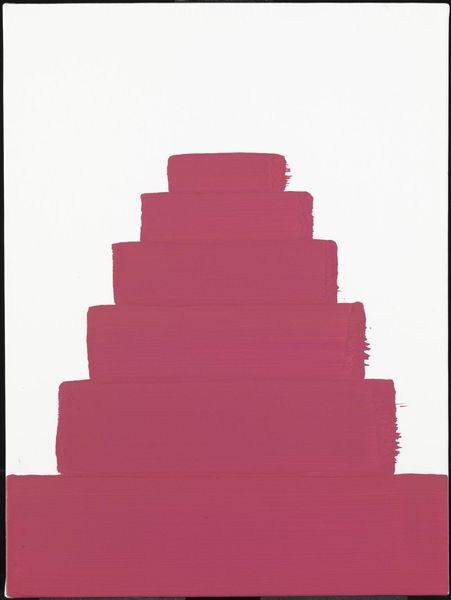
Editor: This is Sadamasa Motonaga’s “Uenohou Ha Masshiro” from 1988, made with ink and acrylic paint. The contrast between the hot pink and black is so arresting! What strikes me most is the starkness, almost graphic in its simplicity. How would you interpret the form of this piece? Curator: Its composition relies heavily on the interplay of positive and negative space, wouldn't you agree? Consider the visual weight of the central white form as it interacts with the surrounding darkness. It's a flat plane activated by shifts in tonality. Notice the subtle gradient of color; from white at the top to intense pink below. What effect does that progression achieve? Editor: I see how the color gradient and precise lines work together. The movement from light to dark almost makes it seem like the shape is glowing from within. Curator: Precisely. The interplay of color and form invites contemplation on its surface. There’s a deliberate flatness here, denying any illusion of depth, reinforcing the materiality of the paint itself. And observe that singular 'antenna' element at the top; it's almost whimsical, providing a curious counterpoint to the more severe geometric forms. What does it suggest to you? Editor: It does disrupt the geometry, softening the severity with that slight touch of the absurd. Curator: The structure calls attention to the painting’s elements in and of themselves – how color and shapes come together to generate experience on the surface. A testament to how simplified visual vocabulary creates powerful, self-referential art. Editor: I appreciate seeing how even with abstraction, every color choice and shape placement influences how we engage with it. I'll look closer next time and consider these compositional dynamics.
Comments
No comments
Be the first to comment and join the conversation on the ultimate creative platform.