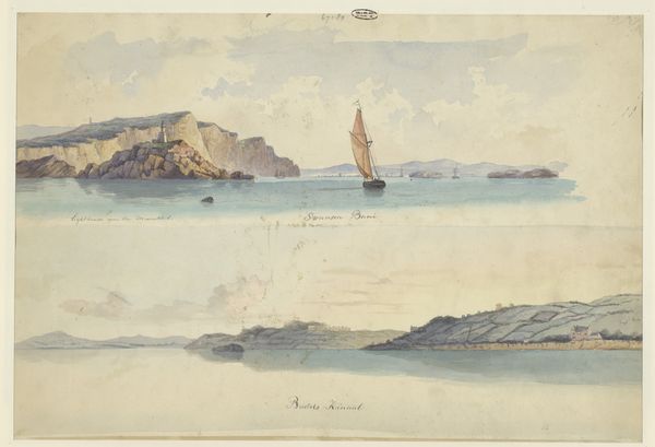
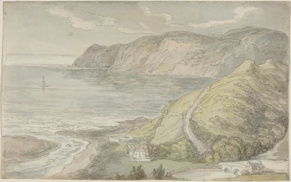
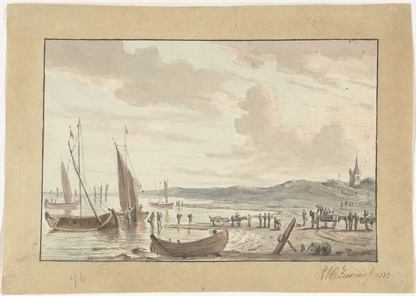
Twee Engelse kustgezichten: Canal at Swansea en Bristol 1827 - 1880
0:00
0:00
willemgruyterjr
Rijksmuseum
Dimensions: height 307 mm, width 450 mm
Copyright: Rijks Museum: Open Domain
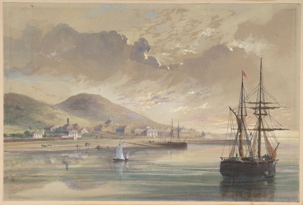
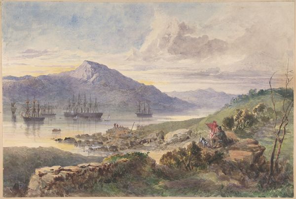
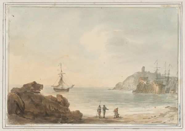
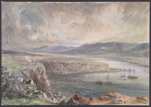
Curator: Standing before us is "Two English Coastal Views: Canal at Swansea and Bristol," a double watercolor by Willem Gruyter Jr., likely completed between 1827 and 1880. Editor: My initial response is tranquility; the washes are so light, creating a soft, airy atmosphere. The composition in two registers – horizontal bands with distinct but related scenes – creates a satisfying structural division. Curator: Indeed. Gruyter's choice of watercolor allows for a delicate interplay of light and shadow. The upper register presents canal scenes, likely Swansea and Bristol respectively, while the lower offers contrasting seaside imagery. Notice the minimal, yet effective use of coloured pencil to delineate key structural components, especially the ships' rigging. Editor: Precisely! The placement of the boats in the canal views draws the eye through both, uniting them visually. The subdued palette also enhances this connection. The absence of dramatic light reinforces a subdued emotional tone – these aren’t bustling harbors. More so, intimate sketches. What social currents may have shaped Gruyter's choice of such humble subjects? Curator: We see increasing urbanization due to the Industrial Revolution during the period in which it was made. Artists began to depict these new landscapes not simply as signs of progress, but places imbued with their own character and history. The contrast here is marked, between the built structures of the canals and the natural sprawl of the beach. It mirrors that period's romantic sensibility. Editor: Consider how this separation further emphasizes each location’s identity, but that neither area feels particularly alive. Curator: The people in both halves are reduced, figures on a stage. They’re integrated into these locations more as elements in the landscape, rather than active inhabitants. It reminds us how linked daily life becomes with environment in Gruyter's vision. Editor: It makes me ponder about Gruyter’s compositional arrangement and use of negative space. Are these choices intended to elicit calm, an intellectual appreciation for structural symmetry in rendering specific geographical conditions? The lack of drama implies detachment. Curator: An intriguing thought. Gruyter is revealing the subtleties within landscapes. With time we’ve grown detached from how those subtleties reflect societal transformations and growing urban expansion into former spaces, just as much of ourselves. Editor: Yes. Ultimately, Gruyter's twin watercolors offer a reflective lens through which to view a moment of significant societal and industrial shifts, and their impact.
Comments
No comments
Be the first to comment and join the conversation on the ultimate creative platform.
More like this