before 1899
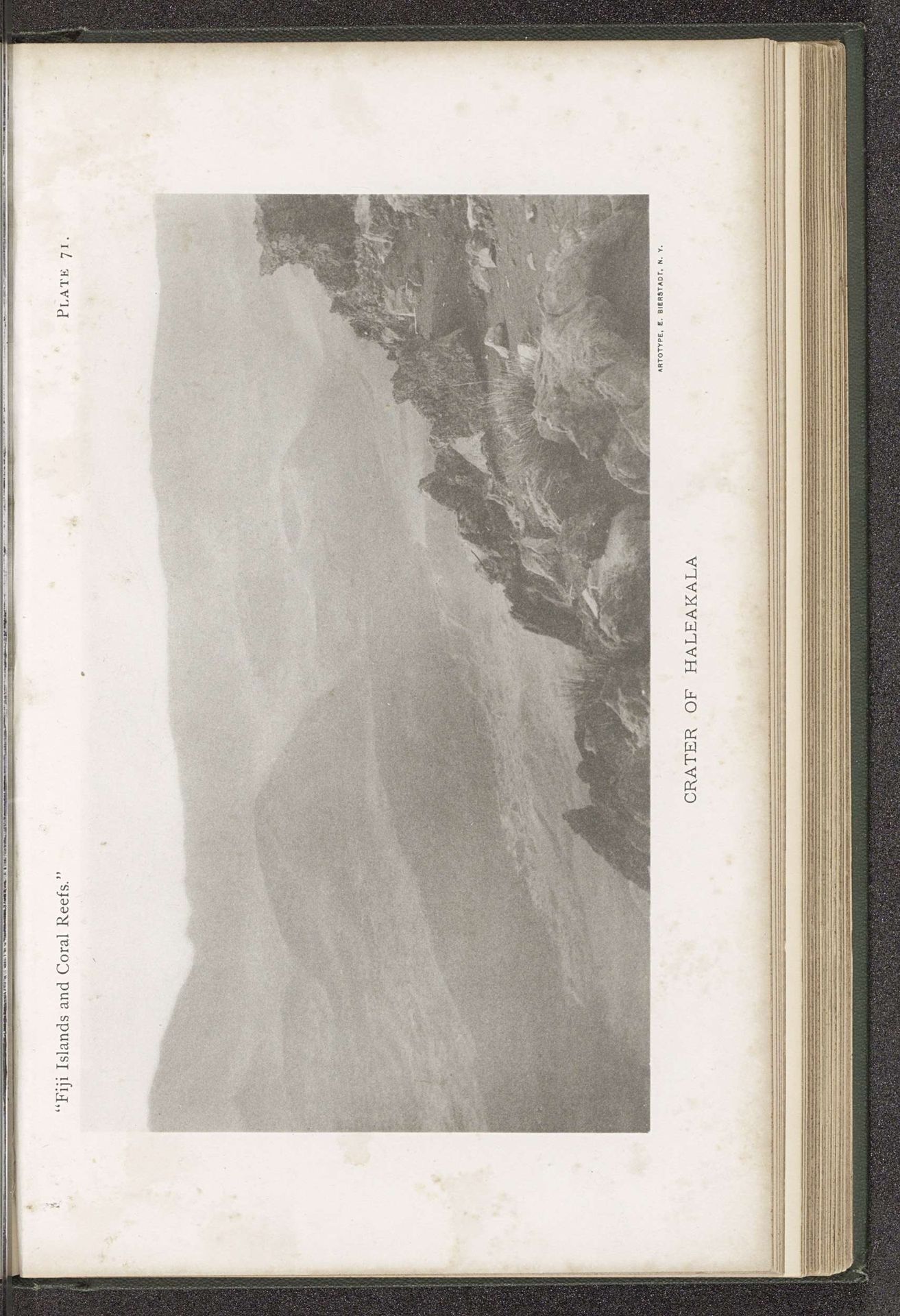
Gezicht op de krater van de Haleakala
Listen to curator's interpretation
Curatorial notes
Editor: Here we have "Gezicht op de krater van de Haleakala," made before 1899. It's printed on paper with ink. I'm really struck by its ethereal quality – the muted colors almost make it feel like a dreamscape. What captures your attention when you look at it? Curator: It whispers to me of time, doesn't it? Look at that faded palette, like colors gently aged by the sun itself. It reminds me of faded memories, distant places... like peering through a dusty telescope. It’s so quiet, so vast… a scene of sublime solitude, don't you think? Makes you wonder what the artist was feeling at that remote spot. Were they filled with awe? Intrigued by the immense scale of this volcanic crater? Editor: Absolutely. The word "sublime" fits it perfectly. It’s awe-inspiring and slightly unsettling, too. Was this type of landscape a common subject for artists at the time? Curator: Well, consider the era. The late 19th century was a time of grand explorations, both literal and intellectual. People were driven to depict the sublime in nature and demonstrate humankind's insignificance when face to face with something of this scale. Did the tags draw your attention? ‘Photo of handprinted image' seems interesting. Can you detect signs of photographic manipulation to create such faded coloring? Editor: That’s a great point! Now that you mention it, I do see certain elements that suggest it could be more than "straight" photography. The overall affect feels intentional in terms of what the creator wants us to see in their work, the drama they wish to evoke. Curator: Indeed. It serves as a poignant reminder that we are just a speck in the grand scheme of things, yet our perception matters. This photograph reminds me that even pale colours possess untold strength and hidden hues when viewed correctly. Editor: I now understand that seeing "Gezicht op de krater van de Haleakala" as merely an artwork limits appreciation and recognition of the deeper complexities, but perceiving it as an evocative experience enhances our engagement, understanding and reverence. Thank you for shedding light.