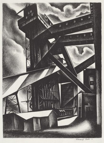
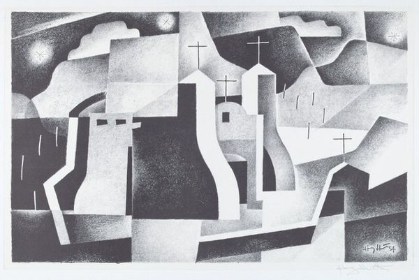
lithograph, print
#
precisionism
#
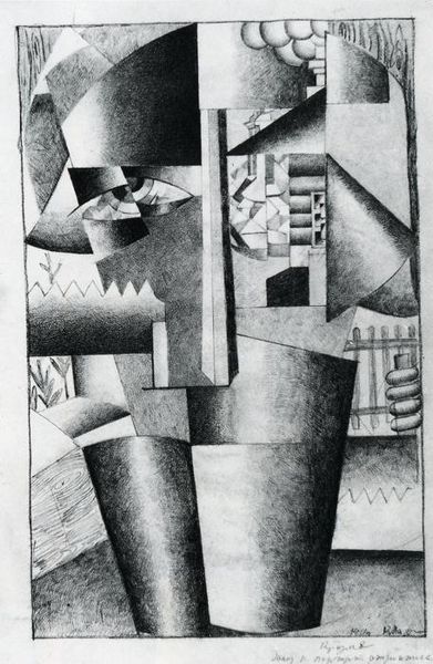
lithograph
# print
#
caricature
#
geometric
#
abstraction
#
cityscape
#
modernism
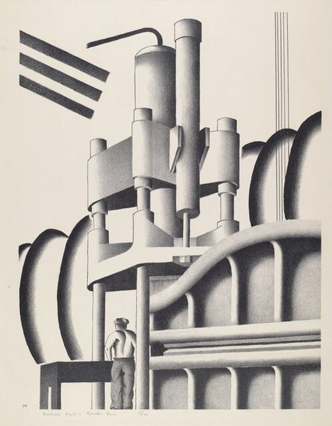
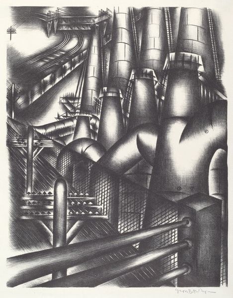
Dimensions: image: 500 x 365 mm sheet: 565 x 436 mm
Copyright: National Gallery of Art: CC0 1.0
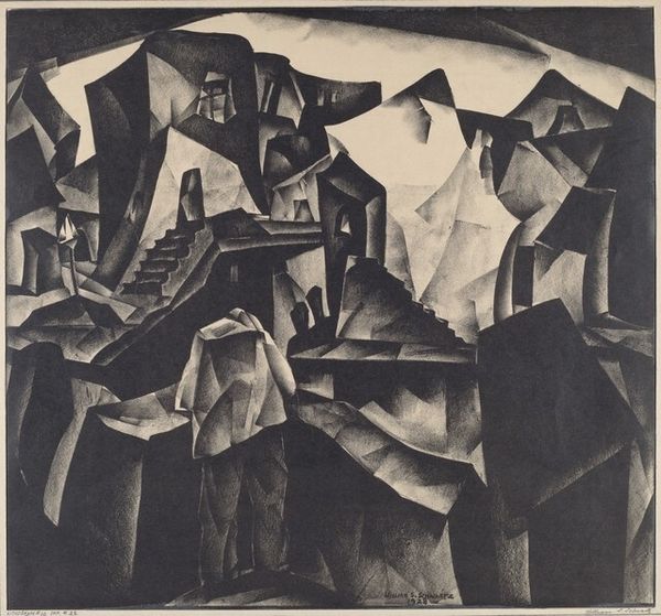
Curator: There's a somber feel about this piece; almost melancholic despite its apparent strength. What's your first take? Editor: It evokes a particular kind of stark industrial poetry. We’re looking at "Lithograph #16" by William Samuel Schwartz, created in 1928. Notice the sharp geometric forms—buildings, smokestacks—rendered in a fairly restricted grayscale palette. It’s quite striking. Curator: Yes, the monochrome enhances the austerity. What's interesting is how it resonates with narratives of both progress and alienation. These structures, products of industry, also seem to box in the small figures that traverse the lower third of the image. They look trapped within the cogs of this industrial machine, doesn't it make you wonder about class and social mobility? Editor: That's a pertinent reading. Precisionism often depicted industry as something clean and celebratory. But Schwartz's depiction has more layers, maybe hinting at the darker side of urban development. Look how he employs lithography to render light and shadow; it lends a distinct tonal quality. You might also want to consider how he renders nature at the front of the piece--the abstract bushes/flowers/smoke seem almost threatening compared to the city backdrop. Curator: I'd never considered the contrast. This does force a re-contextualisation that considers questions around capitalism and social anxieties of the interwar years. The almost claustrophobic composition seems to weigh heavily on this, the figures smallness emphasized compared to these dominating constructs that symbolize technological growth. Editor: Absolutely. Also, consider the role of exhibitions in promoting and shaping the reception of modernist artwork during the late 1920's. It reflects the growing public fascination with these themes of modernization. Its angular design shows Schwartz grappling with the aesthetics of urban experience and trying to come to terms with it. Curator: Schwartz uses stark light and shadows, offering multiple perspectives. It urges a look at urban identity itself--one made of industrial promise but burdened by realities of those who occupy it. Editor: Well, in studying "Lithograph #16," we uncover much about the evolving relationship between art, industry, and the people caught within the modernization project. Curator: A chilling portrayal, presented artfully; food for thought and discussion.
Comments
No comments
Be the first to comment and join the conversation on the ultimate creative platform.
More like this