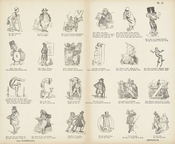
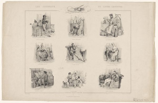
print, engraving
#
african-art
#
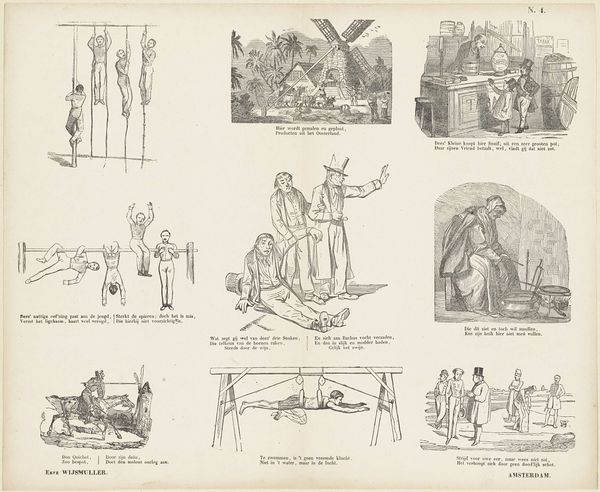
narrative-art
# print
#
pen sketch
#
genre-painting
#
engraving
Dimensions: height 334 mm, width 419 mm
Copyright: Rijks Museum: Open Domain
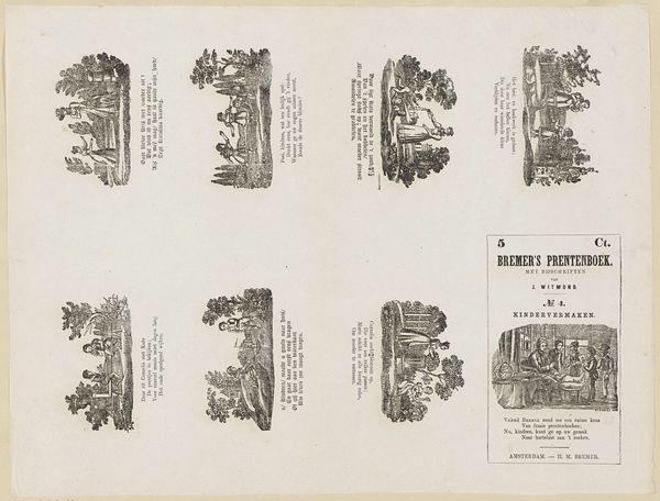
Editor: Here we have “Afrika,” an engraving from Bremer's print book, created sometime between 1867 and 1883. The print has sixteen little vignettes, each with text accompanying it. There's a real variety of figures, a mix of men and women in different clothing styles, and varied activities; some sitting, some standing. What stands out is the linear quality, very defined and stark. What catches your eye in terms of the formal elements? Curator: Indeed, the formal organization of the image is key. Notice the rigid grid structure. Each scene, though depicting different narratives, is contained within a uniform rectangular space. This creates a sense of imposed order. Observe the monochromatic palette – the stark contrast between the black lines and the white space. What effect does this limited palette have on the viewer? Editor: It gives the images a uniform look, and feels... distant. Without color or much shading, it feels very austere. Curator: Precisely. The uniformity desensitizes; any emotional response to the figures is minimized. Focus now on the lines themselves. Notice how they delineate not just form, but also texture. This use of line flattens the subjects. How does this lack of depth contribute to the work’s overall impact? Editor: I think it forces you to focus more on the narrative aspect than getting involved in their implied world. There is no real world depicted so one might study the narrative depicted more. Curator: An insightful observation. Ultimately, the aesthetic choices underscore the way the images functions as documentation: an attempt at a catalog of people and places viewed at a great distance, filtered and rigidly presented. Editor: So by examining the structure, use of lines and color or rather, lack of it we have started to unlock some of the cultural meaning? It all seems like a means of control, an authoritative gaze.
Comments
No comments
Be the first to comment and join the conversation on the ultimate creative platform.
More like this