drawing, paper, ink
#
drawing
#
type repetition
#
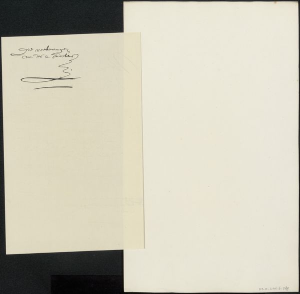
script typography
#
paperlike
#
typeface
#
hand drawn type
#
personal journal design
#
paper
#
ink
#
romanticism
#
folded paper
#
thick font
#
delicate typography
#
thin font
#
calligraphy
Copyright: Rijks Museum: Open Domain
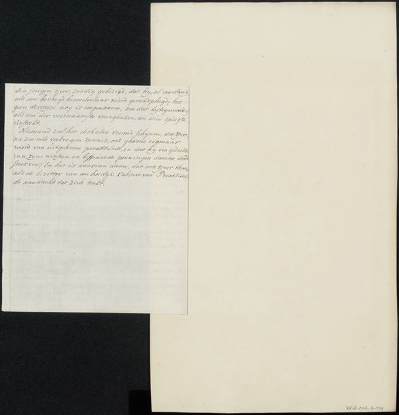
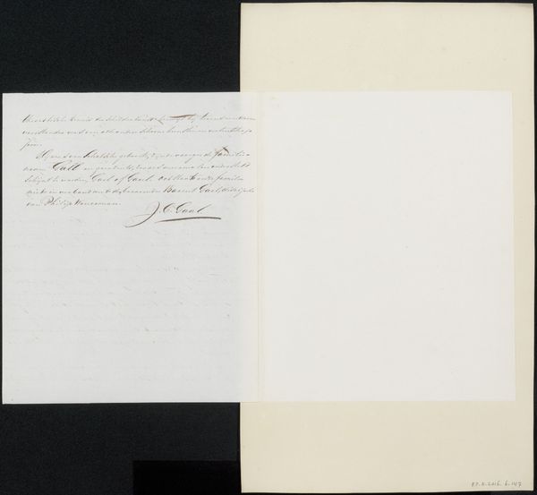
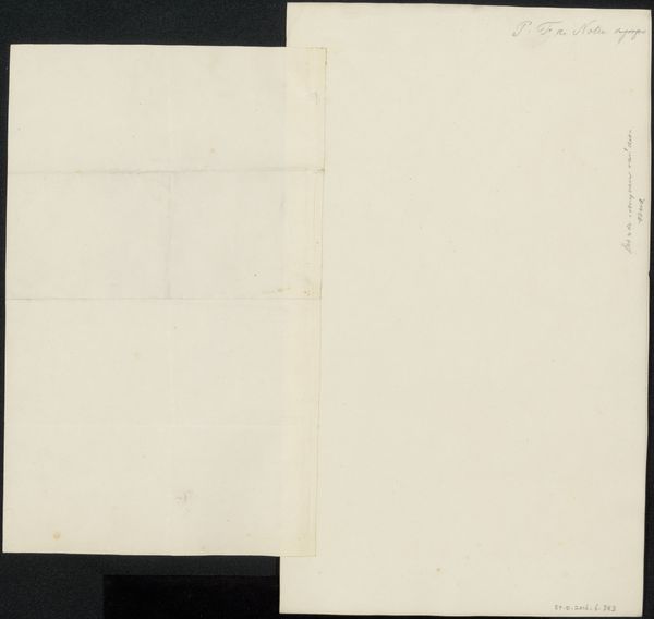
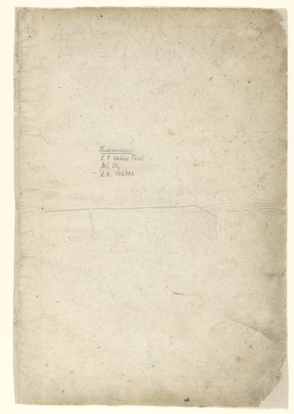
This is Johannes Immerzeel's "Handschrift betreffende Augustin van den Berghe," held at the Rijksmuseum. What immediately strikes the viewer is its stark composition, a dialogue between absence and presence. The larger, blank page contrasts sharply with the smaller, densely inscribed sheet laid upon it. The blankness serves as a visual field that emphasizes the materiality of the paper, its texture and subtle color. It suggests the potential for language, a space of possibility. In contrast, the tight lines of script become a texture in themselves, almost illegible, yet charged with potential meaning. The script represents a concentration of thought. The visible contrast invites us to consider how the form of writing itself, as a material object, can convey as much as its literal content. The juxtaposition also brings forth ideas about semiotics, how meaning comes from absence, and how structures of language create understanding. Ultimately, the arrangement pushes the observer to reflect on the nature of documents and language itself.
Comments
No comments
Be the first to comment and join the conversation on the ultimate creative platform.
More like this