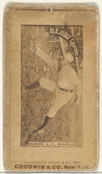
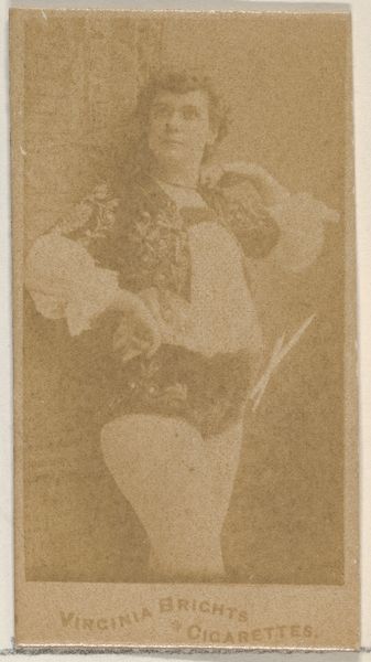
James Dickson "Dick" Phelan, 2nd Base, Des Moines Prohibitionists, from the Old Judge series (N172) for Old Judge Cigarettes 1889
0:00
0:00
print, photography
#
portrait
#
still-life-photography
#
pictorialism
# print
#
impressionism
#
baseball
#
photography
#
men
Dimensions: sheet: 2 11/16 x 1 3/8 in. (6.9 x 3.5 cm)
Copyright: Public Domain
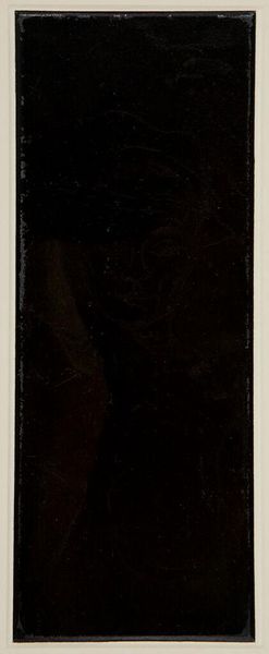
Curator: The Metropolitan Museum of Art holds this curious piece; a print titled "James Dickson 'Dick' Phelan, 2nd Base, Des Moines Prohibitionists," dating back to 1889 and produced by Goodwin & Company as part of the Old Judge Cigarettes series. Editor: Well, it's… pink. Uniformly, intensely pink. It almost obscures the figure; you have to really strain to discern any form in the wash. Curator: Indeed, the pictorialist aesthetic leans heavily into soft focus and atmospheric effects, here achieved, I presume, through the photographic process and printing techniques available at the time. It was common practice to hand-tint these promotional items. The color saturation seems a consequence of that application. Editor: Hand-tinting, of course, connecting it to other practices in early photography which combined labor intensive techniques. Thinking of its mass-production within the structure of the cigarette factory and distributed through product sales makes this piece seem more than just a portrait. It connects baseball, tobacco and visual marketing as components of leisure time activities. Curator: Precisely! We observe how popular culture infiltrated fine art, but also how art itself was commercialized and brought to the masses through these ephemeral objects. Its physical, utilitarian nature – being part of the Old Judge Cigarettes packaging – really complicates our traditional understanding of art's value and accessibility. And beyond, it hints at the Prohibition era's anxieties, embedding these sociopolitical tensions within the object itself. Editor: The flatness of the image too, forces attention onto its surface – that pink surface, specifically. The way the light hits the pigment draws our eyes back again to how and what materials it's made of rather than attempting illusionistic representation. Curator: True. Its aesthetic qualities – the subdued palette and soft focus – are inseparable from its purpose as advertisement, speaking volumes about the period's aesthetic values and the rising consumer culture. Editor: For me, considering its inherent function, the blurry composition, materiality and historical references shifts perspective. Now, it appears as a signpost for cultural anxieties and values through its means of fabrication and dispersal. Curator: A poignant synthesis. Editor: Quite.
Comments
No comments
Be the first to comment and join the conversation on the ultimate creative platform.
More like this