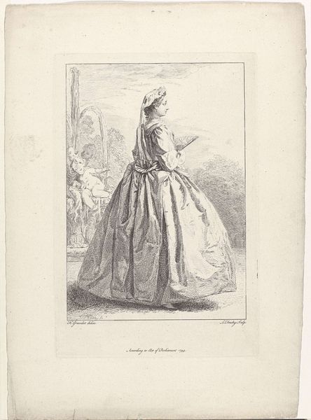
Titelprent voor een bundel met figuren in klederdracht en een boerin uit Den Helder 1728
0:00
0:00
bernardpicart
Rijksmuseum
drawing, print, ink, engraving
#
portrait
#
drawing
#
baroque
# print
#
ink
#
genre-painting
#
engraving
#
realism
Dimensions: height 115 mm, width 70 mm, height 127 mm, width 72 mm, height 172 mm, width 233 mm
Copyright: Rijks Museum: Open Domain
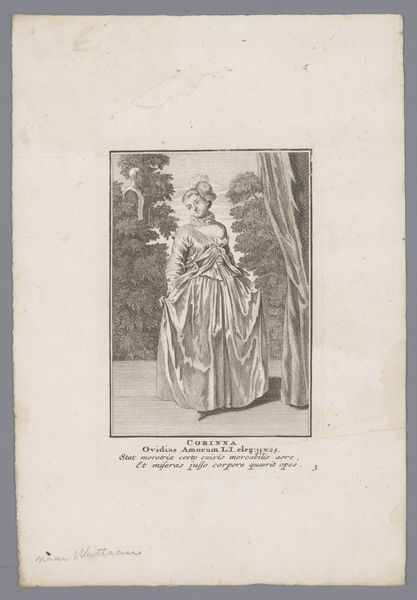
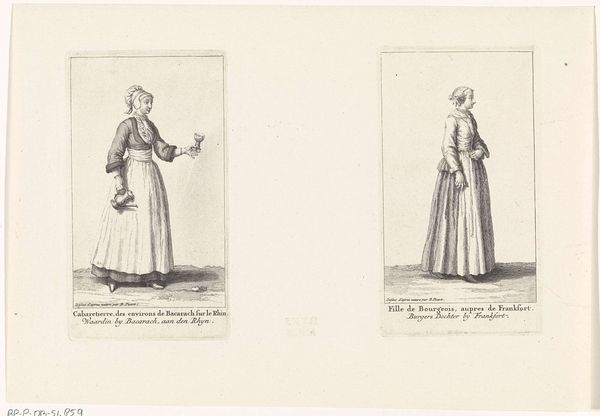
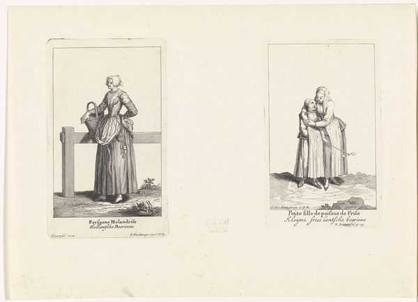
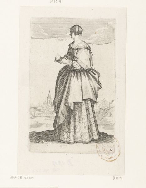
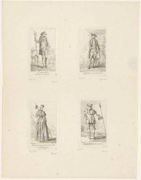
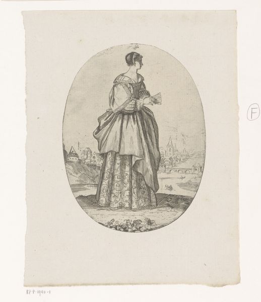
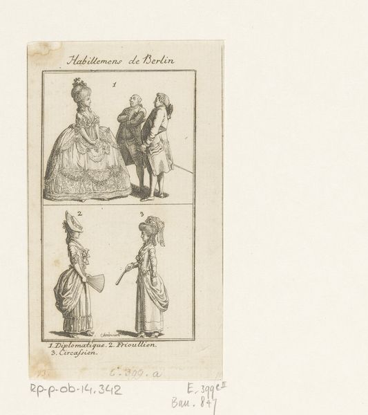
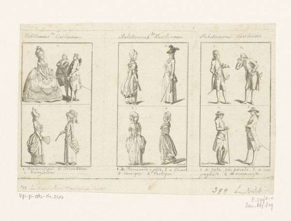
Curator: I see two separate images here, side by side. They’re monochromatic, line-based engravings it seems, on what would likely be off-white paper. One bears the ornate text “Diverses Modes”, and the other is a full-length portrait of a woman. Hmm… A study in contrasts. Editor: Interesting. My first impression is that this feels very…measured. Controlled, even. Everything’s meticulously outlined and positioned, almost as if holding something back. Not bursting with life, but precise. Curator: Precisely. This sheet from 1728 showcases Bernard Picart’s eye for detail and presentation, especially in capturing social mores. On the left, we have the title page of his collection, featuring intricate Baroque framing, while the other presents a "Paifanne du Helder"— a farmer's wife from Den Helder, near Texel, in her traditional attire. Editor: The framing, I noticed. It's classic Baroque, pulling the eye in. Makes me think of formal announcements. And this "Paifanne" as you called her. Hands on her hips, head covered, a robust figure… What's she telling us, unconsciously? Curator: I see a complex interweaving of the self and social prescription. This 'farmer's wife' becomes a representation of regional identity. It speaks to the Baroque era's focus on observation and classification—Picart is not just recording dress, but distilling a cultural essence. Costume books were popular ways to establish, classify and codify what we know about groups of people across regions. The title, Diverses Modes, signals that categorization from the beginning. Editor: So, she's less an individual and more an emblem? Her body a map of societal expectations? This makes the contrast of text and portrait particularly intriguing. It’s like an exercise in controlled representation. Both pages telegraph order and hierarchy through composition and inscription. Even the framing becomes a kind of societal boundary. Curator: The psychological weight behind visual symbols here points to an intriguing cultural dialogue about social roles. By drawing attention to the external, visible markers of identity—clothing, posture—Picart invites reflection on how we construct and perceive difference. There are elements of anthropology at play and, in terms of how it was used at the time, even colonialism and classism were inherent to this type of work. Editor: Right. The artful framing becomes a frame, literally. As the eye is pulled to the images it can’t help but notice those invisible societal confines. It brings to light how deeply symbols shape our perceptions and limitations, while offering insight on a distant people and time. I love how even seemingly straightforward images contain these quiet power plays. Curator: Indeed, an exercise in symbolic language, wouldn't you agree? Editor: Absolutely, one that's both illuminating and perhaps a little unsettling.
Comments
No comments
Be the first to comment and join the conversation on the ultimate creative platform.
More like this