drawing, paper, impasto, pencil
#
drawing
#
landscape
#
paper
#
impasto
#
pencil
#
realism
Copyright: Rijks Museum: Open Domain
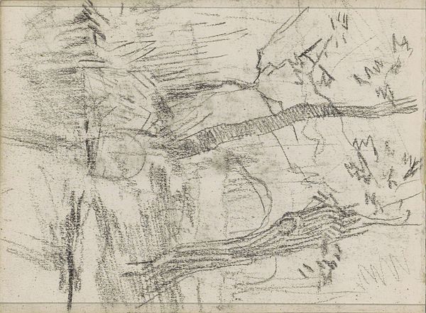
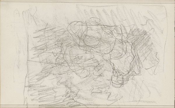
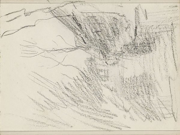
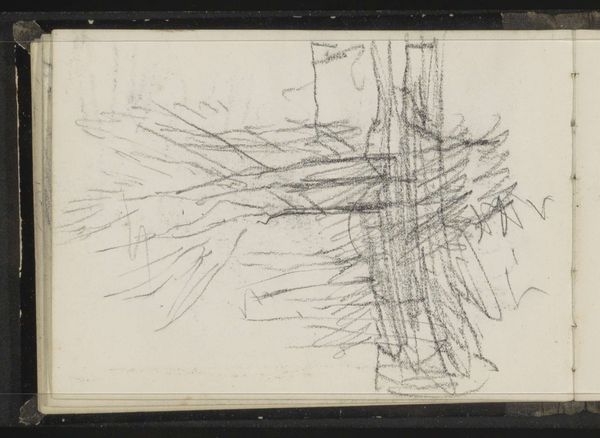
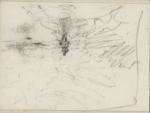
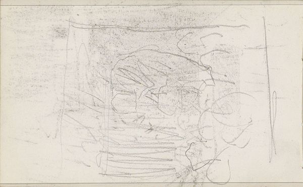
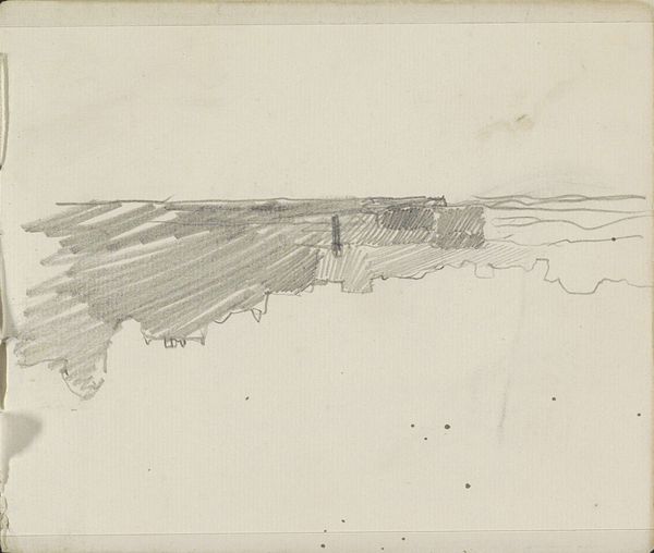
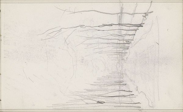
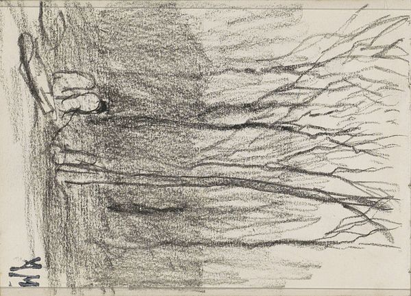
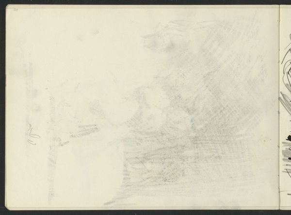
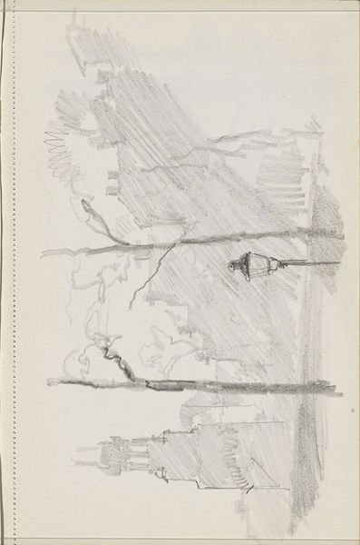
Editor: Here we have Johanna van de Kamer's "Korenschoven op een veld," which translates to "Sheaves of Corn in a Field," dated sometime between 1883 and 1922. It's a pencil drawing on paper. I'm struck by how the artist used layered pencil strokes to convey the texture of the hay; what strikes you about it? Curator: The layering of the pencil strokes is, indeed, quite intriguing. Notice how the artist manipulates line and value to create an impasto effect, simulating texture, despite the medium being a simple pencil drawing. Where do your eyes naturally travel within the composition? Editor: I think my eyes are drawn to the darker areas, toward the center where the sheaves overlap. The varying thickness and direction of the lines there creates depth and volume. Curator: Precisely. And what does this tell us about van de Kamer's compositional choices? It is clear that van de Kamer is using an interplay between light and shadow. Through tonal contrasts, we understand the relationships between individual form, that it presents us with various planes, from surface to depth. Do you find this exploration to add or distract from the reading of this piece? Editor: I'd say it elevates it. It's just a pencil sketch, but it feels like a more finished work because of the attention to those formal elements. I hadn't expected so much depth and movement from a landscape drawing. Curator: Precisely; our encounter with van de Kamer challenges the idea of a pencil landscape work; we observe the use of contrasts and a sense of space. A careful construction brings us from flatness to depth. It's an example of form defining and elevating our experience of content. Editor: Thank you! That gave me a lot to think about when considering the relationships between realism, form and meaning.
Comments
No comments
Be the first to comment and join the conversation on the ultimate creative platform.
More like this