1956
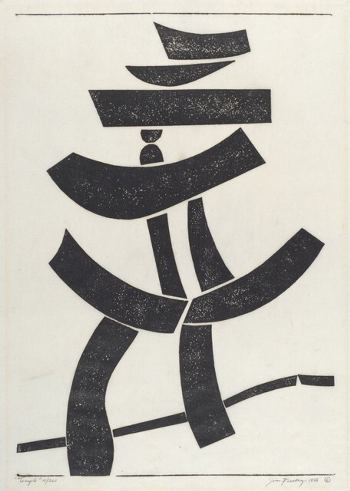
Temple
Listen to curator's interpretation
Curatorial notes
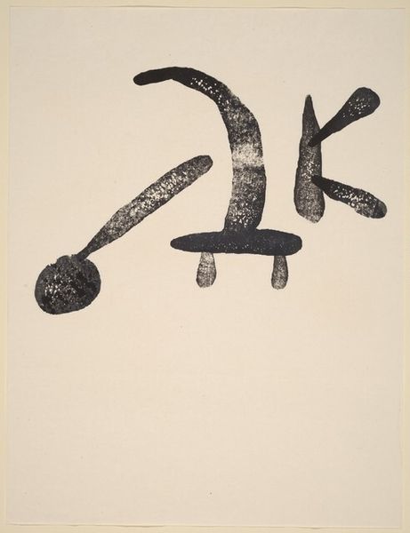
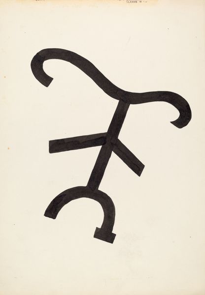
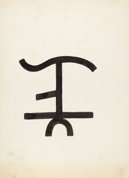
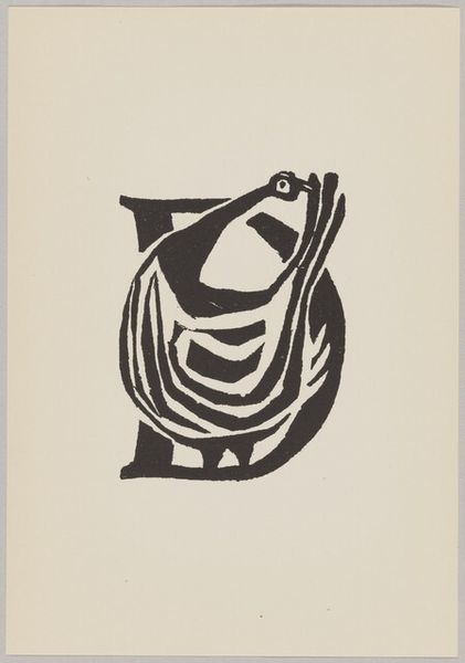
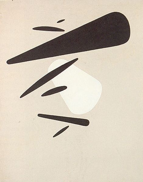
Jim Forsberg made this print, Temple, sometime in the mid-20th century, using black ink on paper to create a world of contrasts and harmonies. The process feels so direct: carving away at a block, leaving these powerful shapes that together build something that feels both solid and ethereal. You can almost feel the texture of the woodblock in the grain of the ink. The piece has a tactile quality, almost like braille. It's not just about seeing, but also about touching, about feeling your way through the forms. Look at how the shapes balance on one another, a kind of precarious calm that makes the whole image feel alive. This print reminds me a little of Ad Reinhardt’s approach to stripping painting back to its essence, though Forsberg's forms have a playful, almost totemic quality all their own. It’s a reminder that art doesn't always have to shout to be heard; sometimes, it whispers the loudest.
