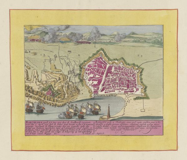
print, watercolor
#
baroque
# print
#
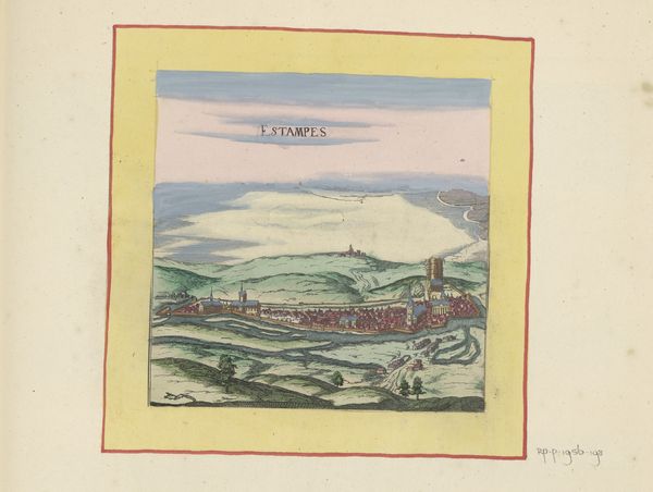
landscape
#
watercolor
#
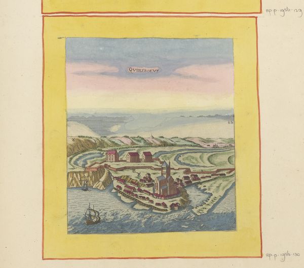
cityscape
#
watercolour illustration
#
watercolor
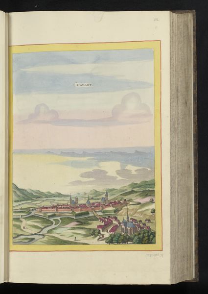
Dimensions: height 159 mm, width 149 mm, height 532 mm, width 320 mm
Copyright: Rijks Museum: Open Domain
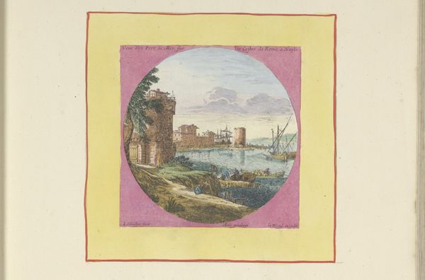
Editor: We’re looking at "Gezicht op Amboise," a watercolor print from 1657. It's a cityscape that feels both detailed and somehow dreamlike with its soft colors and careful rendering. I’m particularly struck by the sky and how soft the clouds look. What do you see in this piece? Curator: The charm of this piece lies, for me, in its tranquility. The artist captures Amboise with a tenderness, don't you think? There’s an almost miniaturist quality in the way the details of the city are rendered. It's a time capsule. The light is just right; it sets a lovely stage and speaks of bygone days. Can you see the balance between nature and city? It's quite lovely, actually. Does it feel more factual, or more of a mood for you? Editor: I agree, it feels like a mood more than pure record-keeping. The details are precise, but they are bathed in that almost hazy, watercolor light, so it gives the piece an idealized aura. Like the artist is showing a memory. Curator: Yes! It invites you into this gentler, less hurried pace. It’s saying "pause." Watercolor prints allow for subtle color gradations. Do you think this piece reflects some characteristics of Baroque? Think of dramatic play with color! Editor: It's making me think more about perspective too. It's interesting how the artist chose to view Amboise from this angle, focusing on the bridge, and I agree, that gentle shift in the light! That perspective is new for me. I was too focused on the colors before. Curator: See how even a simple cityscape opens new doorways into art! That's why art is always alive.
Comments
No comments
Be the first to comment and join the conversation on the ultimate creative platform.
More like this