drawing, paper, ink
#
drawing
#
hand written
#
script typography
#
hand-lettering
#
lettering
#
hand drawn type
#
hand lettering
#
paper
#
ink
#
hand-drawn typeface
#
fading type
#
calligraphic
#
calligraphy
#
small lettering
Copyright: Rijks Museum: Open Domain
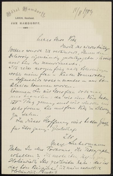
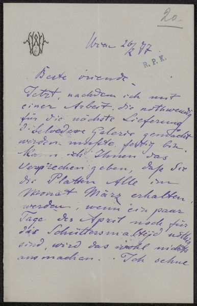
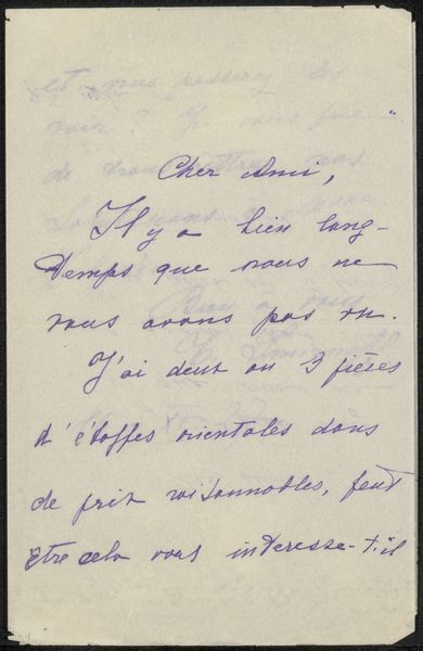
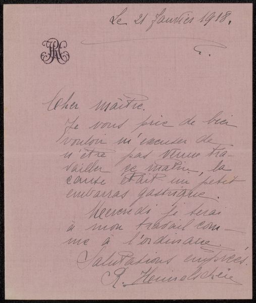
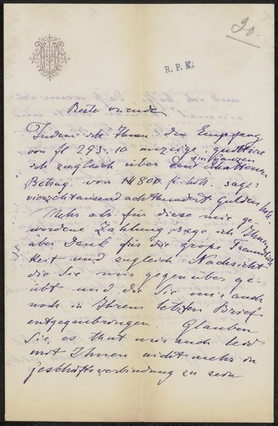
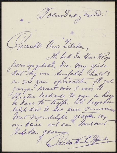
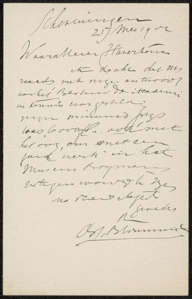
Editor: We're looking at "Brief aan Philip Zilcken," a drawing with ink on paper made before 1918 by Carla van Geuns. The handwriting, with its elegant loops and swirls, gives the impression of a personal and intimate message. What stylistic qualities jump out at you? Curator: Primarily, I see a work preoccupied with line and form. Consider the variations in line thickness. Each stroke conveys a sense of deliberate action, a choreography of pen across paper. The visual rhythm established by the consistent slant of the script underscores a clear formal structure, doesn't it? The spatial relationships between words and lines contribute to the overall composition. Note how the arrangement of text fills the page, yet avoids overcrowding, achieving a harmonious balance between positive and negative space. Editor: That makes sense, I didn't quite see the deliberate intent. Do you think the choice of ink contributes to this effect? Curator: Indubitably. The ink, with its inherent tonal variations, enriches the texture of the lines. Certain areas exhibit a darker, more saturated quality, while others appear lighter, almost faded. This subtle play of light and shadow enhances the dimensionality of the script. Notice how the pressure applied to the writing instrument dictates the varying depths of color, a direct reflection of the artist's hand. Editor: So it’s less about what the letter *says* and more about *how* it's presented? Curator: Precisely. The artwork emphasizes visual components of line, texture and spatial relationship over narrative or contextual implications. Our engagement resides in its aesthetics. Editor: This way of thinking has revealed an entirely new way to approach this kind of drawing! Curator: Indeed. Shifting our focus from content to formal attributes enriches our experience and insight.
Comments
No comments
Be the first to comment and join the conversation on the ultimate creative platform.
More like this