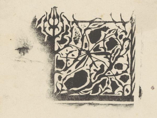
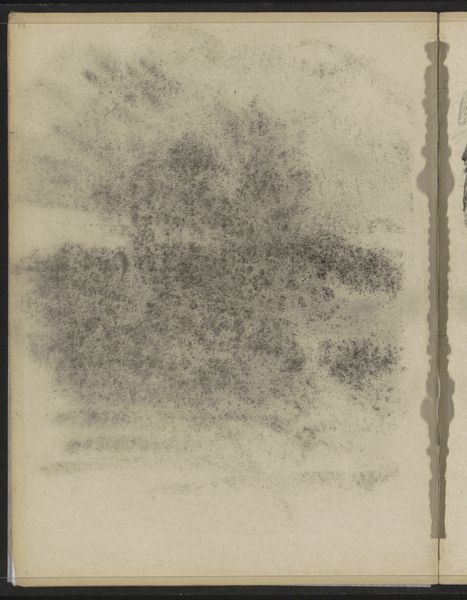
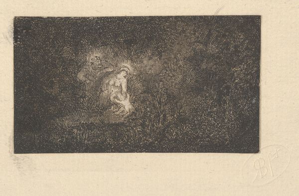
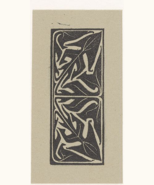
Randdecoratie en staart van het prospectus van het Tijdschrift voor vercieringskunst 1896
0:00
0:00
drawing, graphic-art
#
drawing
#
graphic-art
#
art-nouveau
#
pale palette
#
reduced colour palette
#
fashion mockup
#
personal sketchbook
#
geometric
#
line
#
sketchbook drawing
#
watercolour bleed
#
watercolour illustration
#
fashion sketch
#
sketchbook art
#
clothing design
Dimensions: height 175 mm, width 181 mm
Copyright: Rijks Museum: Open Domain
Curator: This work, from 1896, is by Karel Petrus Cornelis de Bazel, entitled "Randdecoratie en staart van het prospectus van het Tijdschrift voor vercieringskunst," a drawing with graphic elements. Editor: Immediately striking is its spareness, the reduction of elements down to essential lines and the faint suggestion of a muted palette. It feels less like a finished product and more like an intimate glimpse into a preliminary sketch. Curator: Precisely. Notice how de Bazel employs a controlled line, carefully articulating these biomorphic, almost fantastical forms. The negative space is as crucial as the drawn elements, establishing a balanced composition. Observe, too, how geometric shapes underpin the more organic flourishes, providing structural integrity to the overall design. Editor: It reminds me that so much design, even in printed form, starts with a hand. Look at how the materials--the ink, the paper itself--must have informed the iterative development of the work, its function, and even its dissemination within design communities in Amsterdam. I see a handcrafted quality despite its planned intention for larger circulation. Curator: A fruitful observation, indeed. Semiotically, these abstract forms operate almost like pictograms, suggesting an entire symbolic system waiting to be deciphered. They resonate with the broader Art Nouveau movement, particularly in their rejection of rigid academic conventions, though here, tempered by a rigorous geometry. Editor: Knowing it was intended as promotional material reshapes how I view it. It elevates something functional, a vehicle for commerce, into art, but without abandoning the reality of material conditions in late 19th century Dutch workshops and foundries. It speaks to how a new class of tradespeople intersected with artistic innovation in Europe. Curator: So, ultimately, de Bazel's design prompts us to reconsider boundaries, particularly those between the decorative and the structural, the natural and the constructed. Editor: Yes. For me, this single graphic speaks of larger transformations underway regarding who makes art, how art gets distributed, and whom it serves. It is both ephemeral and monumental.
Comments
No comments
Be the first to comment and join the conversation on the ultimate creative platform.
More like this