print, paper
# print
#
paper
#
journal
Dimensions: height 28 cm, width 22.8 cm
Copyright: Rijks Museum: Open Domain
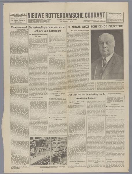
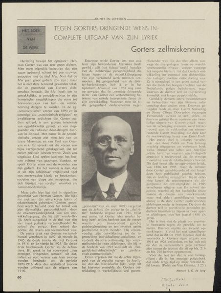
This is a page from 'Vrij Nederland' ('Free Netherlands'), printed on April 21, 1945. What strikes me first is the way information is laid out: the dense blocks of text interspersed with grayscale images. The starkness of the monochrome palette really sets the tone, creating a sense of gravity and immediacy. The texture of the page itself feels important here. You can imagine the thinness of the paper, how it might feel slightly rough to the touch, already aging and delicate. There's something about the way the ink sits on the page, not quite sinking in, that gives it a tactile quality. Consider the way the headlines jump out, bold and declarative. It’s like a visual shout, demanding attention. All of this reminds me a little of Hannah Höch, or maybe John Heartfield, in the way they used the visual language of print media to convey really profound ideas. In art, as in life, it is often in the conversation that we find meaning.
Comments
No comments
Be the first to comment and join the conversation on the ultimate creative platform.
More like this