drawing, print, linocut, ink
#
portrait
#
drawing
#
ink drawing
# print
#
linocut
#
figuration
#
ink
#
linocut print
#
pen-ink sketch
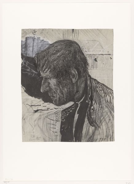
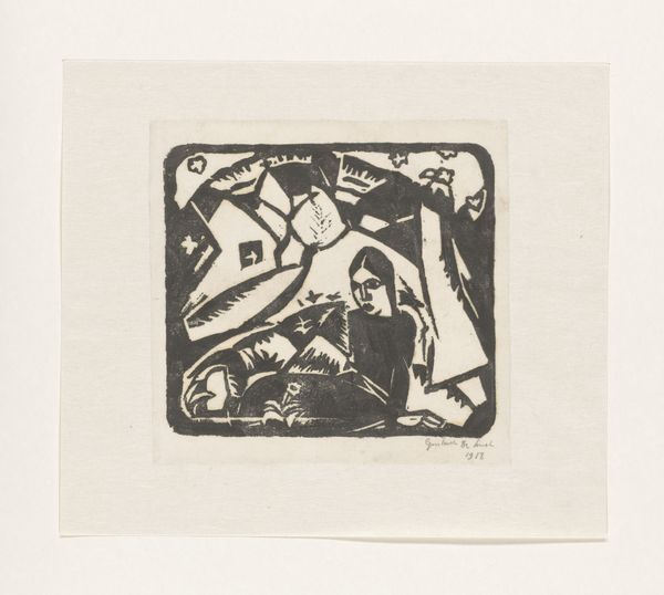
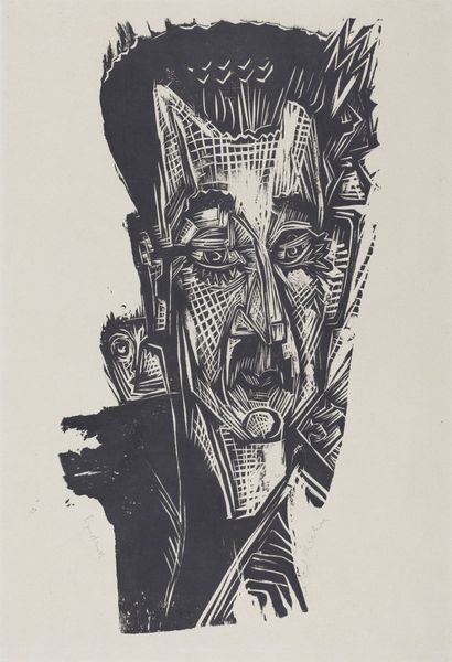
Dimensions: height 390 mm, width 525 mm
Copyright: Rijks Museum: Open Domain
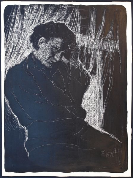
Curator: It has a somewhat haunting quality. Is that intentional? Editor: That might be a bit too subjective, but the high contrast definitely creates an unsettling visual experience. We’re looking at "Vader en kind," or "Father and Child" in English, a linocut print made by Rein Dool in 1968. It's a figural portrait rendered primarily in ink. The Rijksmuseum is its current home. Curator: Linocut… interesting choice. So, we are looking at labor then. Mass production but also each copy unique. The artist is deliberately cutting away at a material to then apply ink… How does the labour reflect its cultural values at the time, especially in figuration? Editor: Exactly! There's the process, right? I believe Dool worked at a time of reconstruction in the Netherlands after the war. And although Dool wasn't explicitly a member of any one group, many artists used figuration to speak to political upheaval, particularly when critiquing institutions. One question to explore is where this family sits in that cultural dialogue of change. Curator: True. Considering that we are talking about print production... How does it make it more accessible to society? Does that cheapen the art, making it more commodity, and a cultural object that feeds into capitalistic gain? Or does that promote a cultural movement making art for the masses. And who exactly is the mass target for this artwork? Editor: I like that tension. Looking closer, you can see those raw, expressive lines characteristic of linocut, the tactile evidence of its creation. In Dool’s hands, the linocut isn't just about reproduction. What social class can afford prints, and does having 'art' validate one’s place in a hierarchy? Curator: Right! I'm not so sure though that it’s about affordability. Looking at the dark massing of ink – Dool really digs into that lino block, and its about the accessibility of it being a multiple as a form. Editor: Perhaps…It is interesting to view this print, displayed in museums for the elites. This challenges ideas of "high art" but simultaneously elevates this to canonical artwork. Its history that changes it. Curator: Agreed. By displaying it here in the Rijksmuseum we are part of its continued history. So it asks the questions "how we display the material, where it sits" – for more historical social dialogue to a contemporary one!
Comments
No comments
Be the first to comment and join the conversation on the ultimate creative platform.
More like this