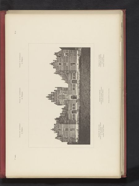
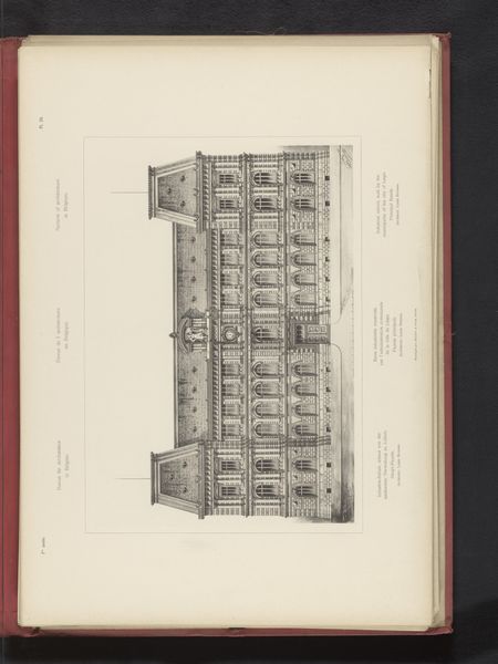
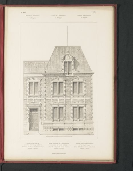
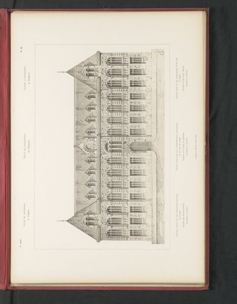
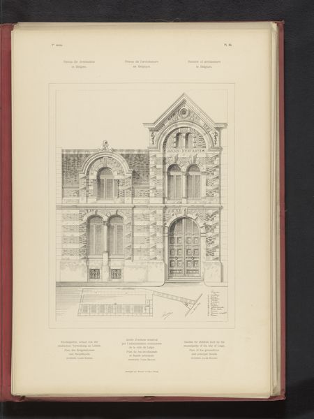
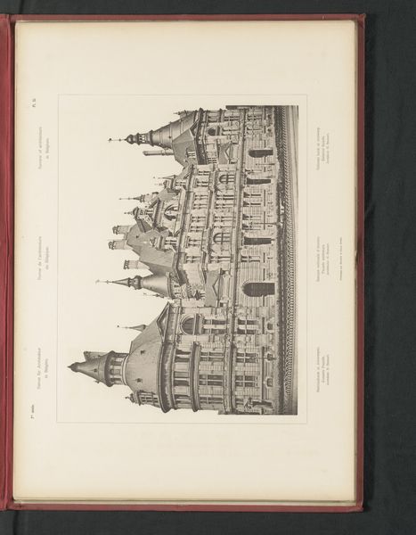
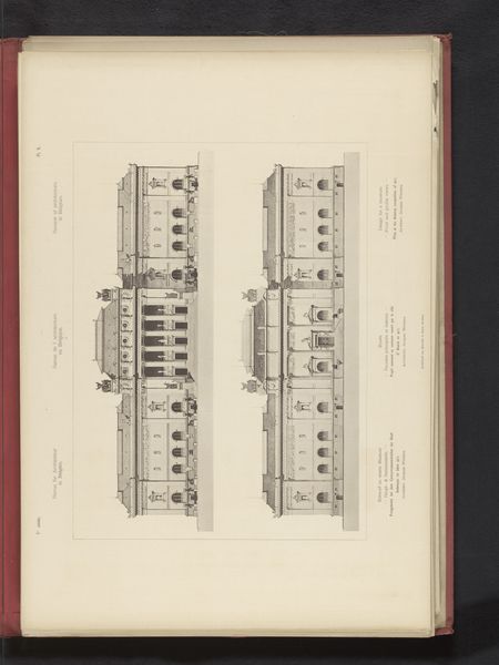
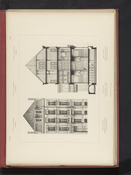
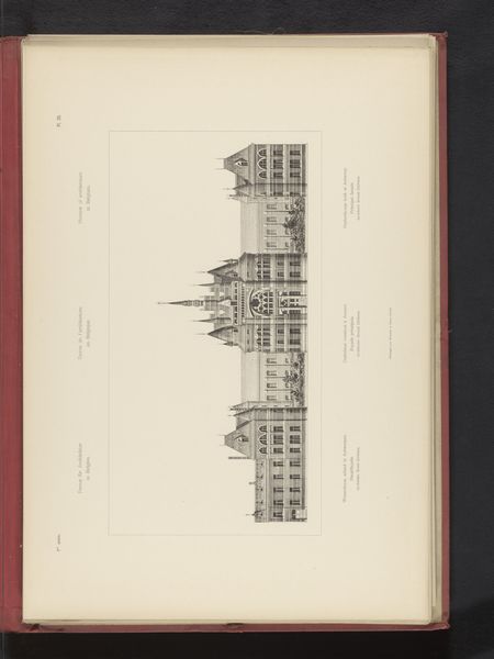
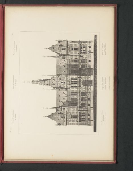
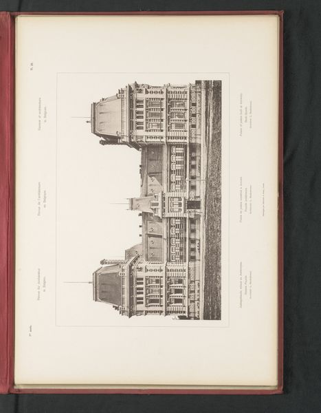
Reproductie van een ontwerp van een vooraanzicht van een lagere school en een reproductie van een plattegrond van een lagere school, door Louis Boonen before 1893
drawing, paper, ink, architecture
drawing
paper
ink
academic-art
architecture
Dimensions: height 502 mm, width 356 mm
Copyright: Rijks Museum: Open Domain
Curator: Immediately, a hushed serenity falls over me. The rigid symmetry, so precise...it feels like a beautiful, complicated clockwork mechanism captured in ink. Editor: This meticulous ink drawing from before 1893 reproduces a design by Louis Boonen for a lower school. What's striking is that the medium--paper and ink--lends this public structure a quiet intimacy, almost a paradoxical quality for something designed for collective learning. Curator: Exactly! Paradoxical, that’s it. On the one hand, this imposing facade evokes institutional authority, those sharp angles projecting purpose. On the other, those detailed plans hint at the energy contained within those walls - the hum of learning, friendships forming… it's far from sterile. Editor: Absolutely, though consider the socio-political context of late 19th-century Belgium. This was a time when the state aimed to consolidate national identity through universal education. A building like this wouldn’t simply house students; it projected power, normalizing values and civic duty through architecture. Curator: See, I never think of civic duty first! But I guess those regimented classrooms, the very formal facade, served as architectural metaphors. I'm captivated by the spartan aesthetic; every line is calculated, isn't it? Yet somehow, the draftsmanship has warmth to me, almost a fondness… maybe the architect's dream for future pupils seeped into the paper. Editor: Well, those architectural dreams were very carefully shaped! Look at the reproduction of the layout: notice the clear delineation of spaces, reinforcing established hierarchies – teacher at the front, students in rows. The school as a social technology! Still, I concede there's undeniable artistry. The detailed façade rendering suggests civic pride but it may simultaneously humanize what otherwise would feel austere. Curator: So, in essence, Boonen delivered a societal statement on paper. A physical entity planned methodically, stroke by stroke, using vision, artistry, craft. Editor: A blend of pedagogy, power and representation of Belgian societal ambitions laid bare, stroke by stroke. Indeed.
Comments
No comments
Be the first to comment and join the conversation on the ultimate creative platform.