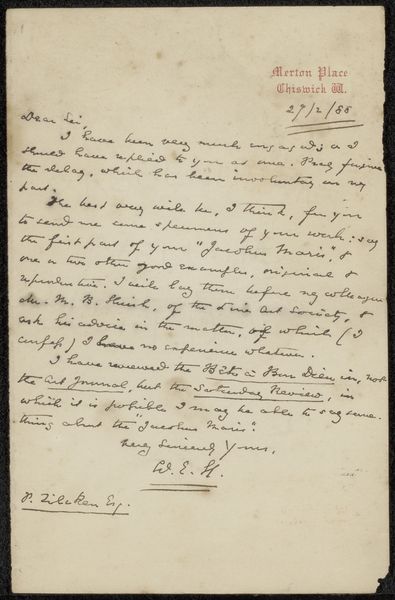
drawing, paper, ink, pen
#
drawing
#
hand-lettering
#
ink paper printed
#
hand drawn type
#
hand lettering
#
paper
#
personal sketchbook
#
ink
#
hand-drawn typeface
#
ink colored
#
pen work
#
sketchbook drawing
#
pen
#
genre-painting
#
sketchbook art
Copyright: Rijks Museum: Open Domain
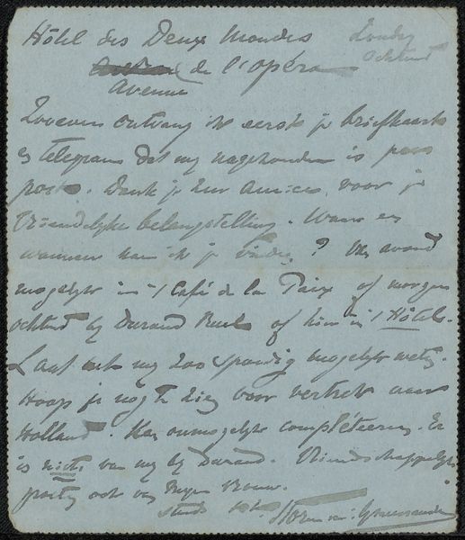
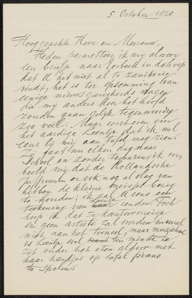
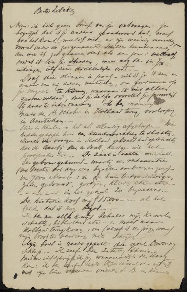
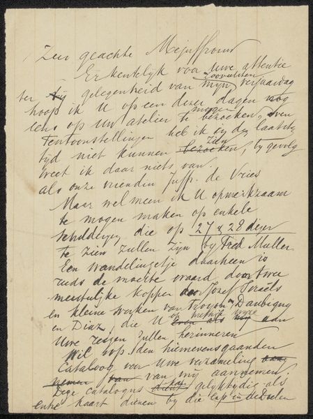
Curator: "Brief aan anoniem," dating roughly from 1786 to 1850, is an intriguing specimen housed at the Rijksmuseum. Executed with pen and ink on paper, it immediately strikes one as a study in contrasts – the crisp linearity of the lettering against the slight discoloration of the aged paper. What, specifically, arrests your attention when viewing this work? Editor: The texture, really! The stark black ink against the creamy paper makes me wonder about the relationship between text and image. What elements stand out to you? Curator: Formally, I’m drawn to the rhythmic quality established by the hand-lettering. Notice how the variations in stroke thickness and letter spacing create a distinct visual cadence, almost like a musical score. The hand-drawn typeface is more than a means of conveying textual information. It operates on a pictorial level as well. Consider how the density of the script at the top gives way to a more open and airy arrangement at the bottom. Do you see this division as merely practical or perhaps intentional? Editor: I see what you mean about the cadence. The darker areas at the top pull your eye in, and then it kind of releases as it goes down. Was this common for letter-writing during that time period? Curator: More interesting than historical commonality, is considering it as an intrinsic aspect of the drawing's function. It serves not just as documentation but as aesthetic form. Editor: Right, looking at the "how," not just the "when." Curator: Exactly. And within that how, what are the repeating formal features and principles? It makes you consider even minor details as parts of the structure, almost as intentional elements rather than scribbles on paper. What features of that inking create those repetitions? Editor: The curve of certain letters, maybe? I see that curve repeating and echoing throughout. Thanks! It's given me a fresh perspective. Curator: Precisely! Hopefully you'll find that new view useful to further research into that structure!
Comments
No comments
Be the first to comment and join the conversation on the ultimate creative platform.
More like this