Dimensions: height 131 mm, width 192 mm
Copyright: Rijks Museum: Open Domain
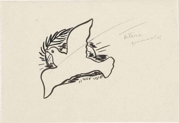
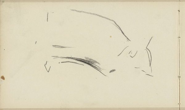
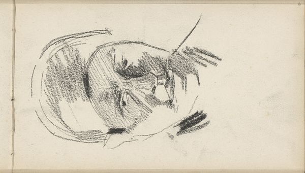
Leo Gestel made this drawing, Vredesduif, with pen and ink on paper. It’s just gorgeous, isn’t it? The marks are so clear and certain, the image has a wonderful graphic quality. Gestel really embraced the process of artmaking, letting the ink flow and the image emerge. I love the way he uses hatching to create shadows on the dove’s wing and body. The layering of these fine, closely spaced parallel lines makes the form feel so solid, almost sculptural. And then there’s the olive branch in its beak, rendered with these spiky, energetic strokes that contrast with the smooth, rounded shape of the dove itself. That contrast really adds to the emotional depth of the image. Gestel reminds me of Picasso, but with a Dutch sensibility. Like Picasso, he wasn’t afraid to experiment and push the boundaries of representation. It's a testament to the fact that art is an ongoing conversation, always evolving. And that peace remains such an elusive but powerful symbol.
Comments
No comments
Be the first to comment and join the conversation on the ultimate creative platform.
More like this