Dimensions: height 390 mm, width 345 mm
Copyright: Rijks Museum: Open Domain
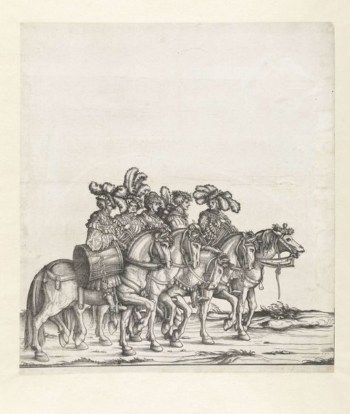
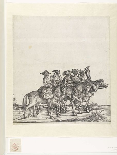
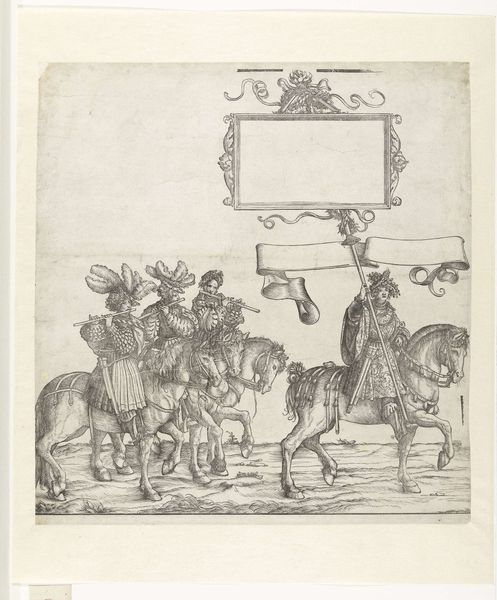
Editor: This print, "Vijf hofmaarschalken te paard," made sometime between 1483 and 1526 by Hans Burgkmair, is incredibly detailed. The textures he's created with simple lines are amazing, like the horses' fur and the elaborate clothing. What strikes me is the formality and the slightly static quality. What do you see in it? Curator: Intriguing observation. Focusing purely on form, the artist masterfully manipulates line and tone to create depth and texture. Note the consistent directionality in hatching—predominantly vertical, which provides a structural framework for the figures and landscape. Ask yourself how this directionality influences your reading of space. Editor: It makes it seem flatter somehow, more about the surface. Curator: Precisely. The flatness contributes to a hieratic quality, elevating the figures into iconic representations rather than portraits. What effect do you think that flattening effect, against the heavy detailing, is achieving? Editor: It's a tension… almost like the detail is fighting against the flatness. So it brings your attention back to the surface and that surface design becomes important. Curator: An astute conclusion. Burgkmair, through the interplay of detailed engraving and flattening perspective, prioritizes surface design and symbolic representation. These are not merely people but distillations of power and social position expressed through intricate graphic design. The artist compels the viewer to acknowledge surface not as a mere decorative field but a canvas wherein power and authority become inscribed. Editor: That is fascinating; I had not thought about surface having authority like that! Thanks for expanding my viewpoint on this piece.
Comments
No comments
Be the first to comment and join the conversation on the ultimate creative platform.
More like this