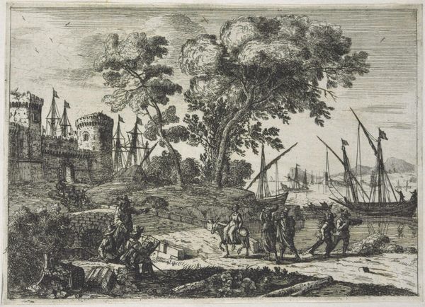
print, etching, engraving
#
dutch-golden-age
# print
#
pen illustration
#
pen sketch
#
etching
#
old engraving style
#
landscape
#
figuration
#
line
#
genre-painting
#
engraving
#
realism
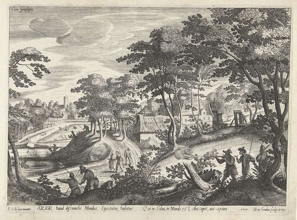
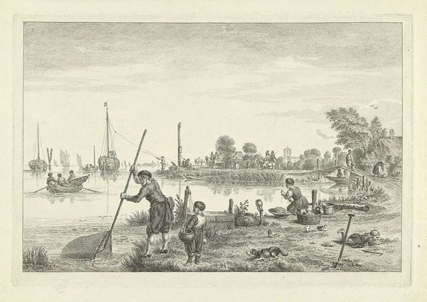
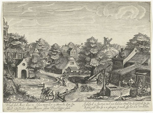
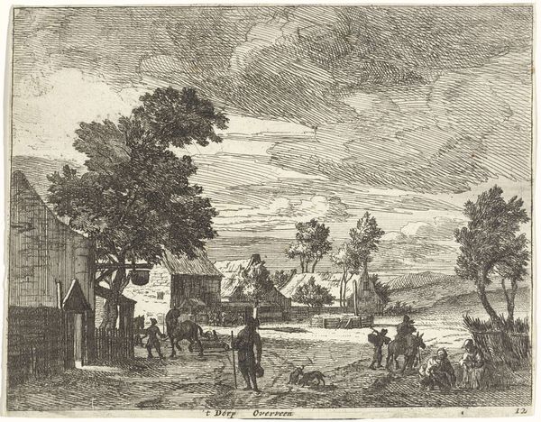
Dimensions: height 103 mm, width 155 mm
Copyright: Rijks Museum: Open Domain
Curator: Here we have Claes Jansz. Visscher's "Turfsteken, ca. 1600," dating from 1608, a print currently held at the Rijksmuseum. Editor: What a bustling scene! It feels surprisingly balanced, despite the sheer amount of activity. My eyes are drawn to the rhythmic repetition of those peat stacks, and then the almost diagrammatic depiction of the figures. Curator: Visscher was known for capturing the Dutch landscape with meticulous detail, elevating these everyday scenes into something almost…symbolic. The process of "turfsteken," peat cutting, was vital to the Dutch economy. Peat served as the primary fuel source. So in some ways it documents a foundational process, a foundation both literal and metaphorical. Editor: I'm interested in how Visscher uses line. There’s a certain uniformity to the strokes, yet it’s deployed to differentiate textures – from the coarse, earthy peat to the feathery trees in the background. It almost feels like a precursor to pointillism. Curator: That landscape stretches out like a tapestry. The presence of the church, the windmill, all speak to the human endeavor in transforming the landscape, exerting their influence, marking their territory through action. This piece resonates with collective memory and cultural identity tied to the land. Editor: You’re right. Even though it’s rendered in monochrome, it speaks to the larger question of humankind’s imprint. The water wheel by the mill, the figures extracting fuel - an overt depiction of manipulating resources. I would be curious about its original reception. Curator: Prints like these circulated widely, reinforcing values and showcasing the industry upon which their society rested. The symbols were clear to people in his era, I think. We see some familiar ideas here that we continue to wrestle with today. Editor: I agree; it feels surprisingly contemporary. The sharp lines draw you in and keep the composition taut. A stark reminder of both progress and extraction. I hadn't expected it to speak so strongly across the centuries.
Comments
No comments
Be the first to comment and join the conversation on the ultimate creative platform.
More like this