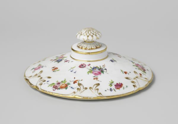
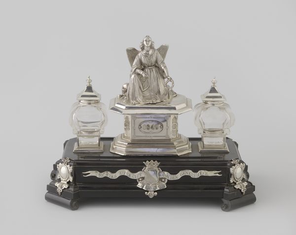
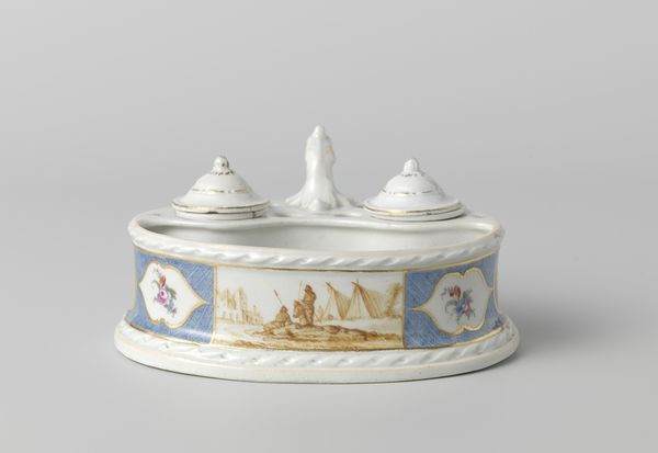
Dimensions: height 25 cm, width 27.6 cm
Copyright: Rijks Museum: Open Domain
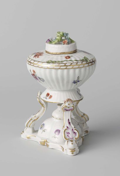
Editor: This is the "Ink Stand," made of earthenware around 1777 to 1790 by Porseleinfabriek Den Haag and housed at the Rijksmuseum. It has an almost theatrical quality, doesn't it? All the elaborate decoration and flourishes give a sense of ceremony to something as mundane as writing. What strikes you when you look at it? Curator: I’m immediately drawn to the symbolic weight of the floral motifs. Think about the cultural moment; the Rococo era embraced ornamentation, yes, but flowers also held layers of meaning. Roses, like we see painted on the bell, often symbolize love, beauty, and secrecy. What might that suggest about letter writing in that time? Editor: That letter-writing was maybe a more intimate or romantic act? That’s interesting. Curator: Precisely. Consider the color too, this restrained use of lilac and gold. Purple has long been associated with royalty, and gold, of course, speaks to wealth and status. What stories might these colors tell about the owner and intended recipient? Were they trying to project a certain image? Editor: It’s easy to overlook the individual symbols. I was focused on the overall opulence, not the nuances. Curator: And what about the lion heads supporting each piece? What feelings do you associate with the lion as a symbol? Editor: Strength, definitely, maybe authority. They feel almost contradictory combined with the delicate flowers. Curator: Perhaps. Or, maybe that contrast speaks volumes about the complexities of power and vulnerability within the act of communication itself. Letters, after all, can be weapons or declarations of love. The images are carefully chosen. Editor: That’s a compelling idea; it gives me a lot to consider regarding the piece beyond just surface-level beauty. Curator: And hopefully provides a more nuanced lens through which to appreciate not just the object but the era in which it was created!
More like this