Copyright: CC0 1.0
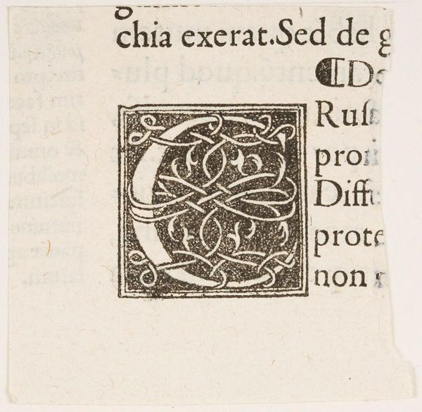
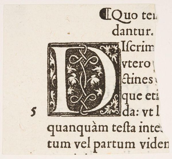
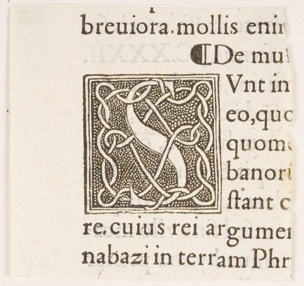
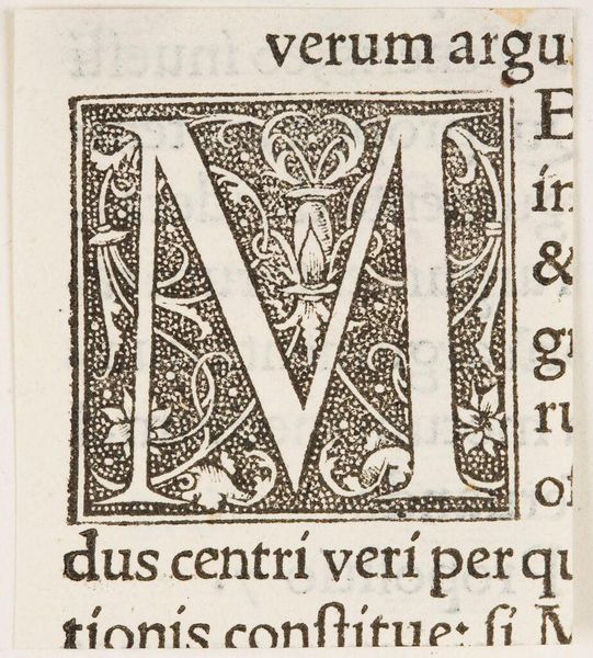
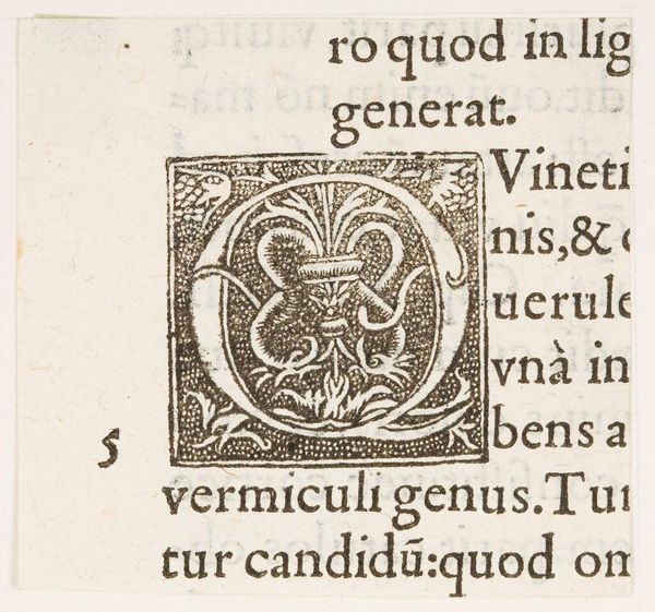
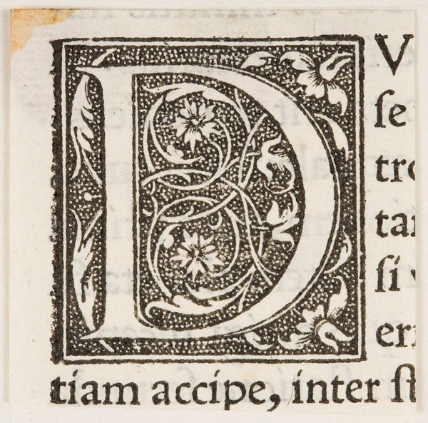
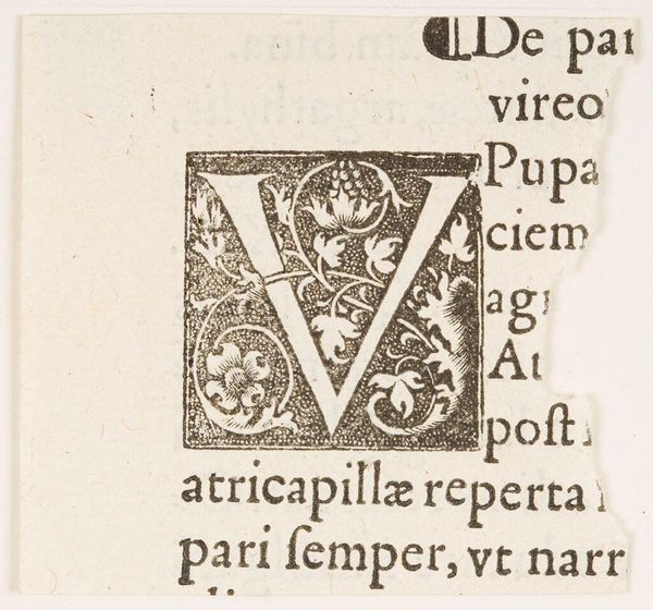
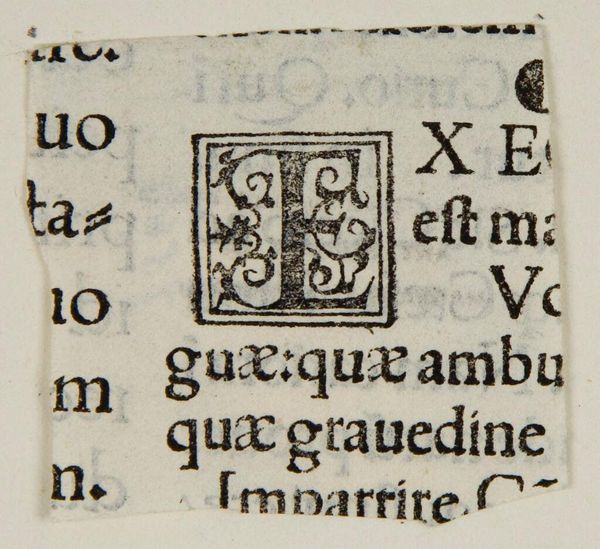
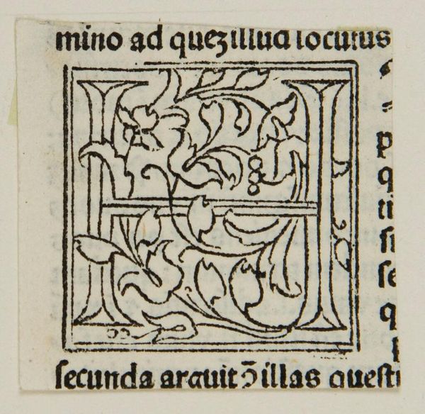
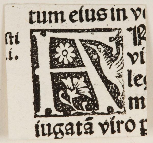
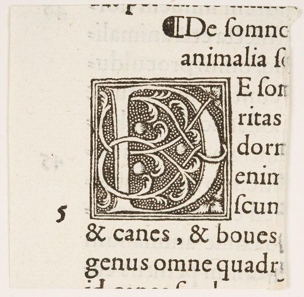
Curator: This image, titled "Initial C," is an intriguing example of early typography from an anonymous creator. The detail is really quite something. Editor: It’s true, the "C" itself feels like a maze. All those interwoven lines give it an almost Celtic or Nordic sense of timelessness and continuity. Curator: Absolutely. The process of creating the block, likely through woodcutting, shows a level of craft and labor that's easy to overlook today. The surrounding text points to its function within a larger printed work. Editor: That’s right. And the way the letter is embellished, it signals importance, reverence perhaps for the words that follow, which I can infer from the visible words in Latin. Curator: Considering its probable role in mass production, it blurs the lines between fine art and functional design. Editor: Agreed. It makes you consider the cultural weight of literacy itself, doesn’t it? Curator: Indeed. I’m struck by the inherent tension between mechanization and individual artistry at play here. Editor: I am left pondering how even a single letter can be so symbolic.
Comments
No comments
Be the first to comment and join the conversation on the ultimate creative platform.
