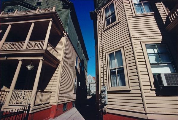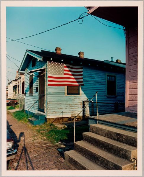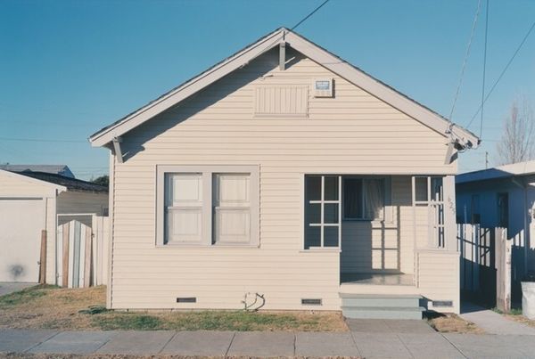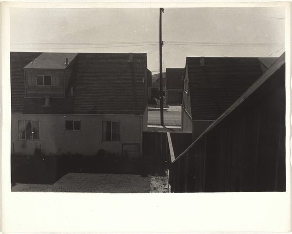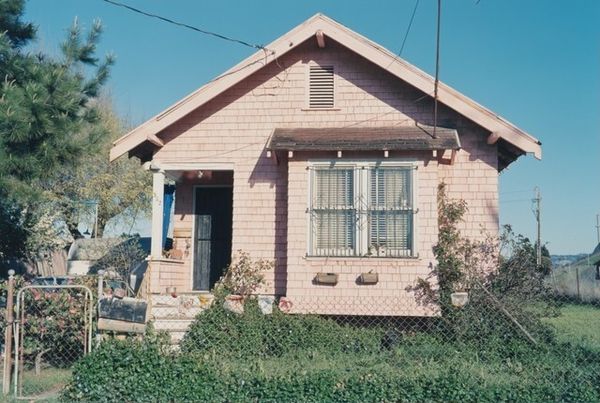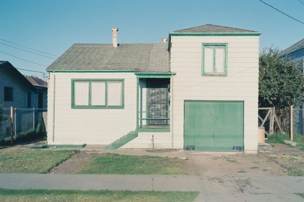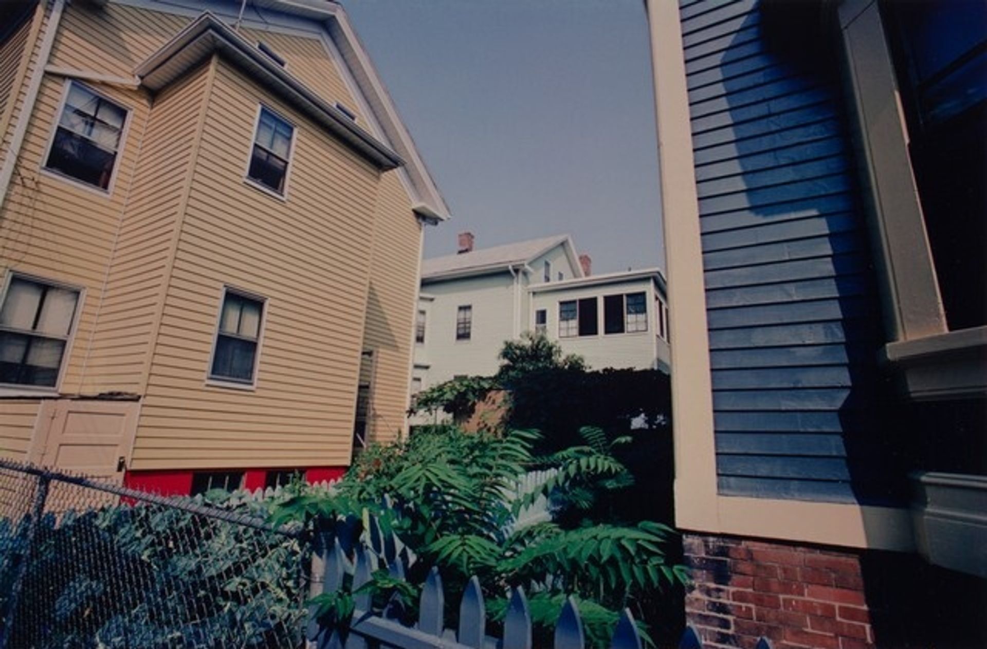
1977
Providence
Listen to curator's interpretation
Curatorial notes
Editor: This photograph is called "Providence," taken in 1977 by Harry Callahan. It feels very much like looking into a hidden, private space, almost like a secret garden, even though it is clearly in an urban environment. What do you see in this piece? Curator: Indeed. We should first examine the arrangement of the structural components. Note how Callahan has meticulously framed the image. The interplay of horizontal lines – the siding of the houses, the fences – with the verticality of the buildings’ edges and the shadows, creates a complex geometric composition. How does the interplay of the planar surfaces create the illusion of depth in two dimensions? Editor: That's interesting. I was so focused on the “garden” aspect I hadn’t really considered how much geometry is at play here. Do the colors contribute to this sense of structure? Curator: Assuredly. Observe the muted tones—the blues, yellows, and greens, carefully balanced, which grant the image a sense of formal unity and underlying tonality. These relationships within the color palette augment the overall architectural geometry. Editor: So, even in what appears to be a simple snapshot of an everyday scene, the careful construction of lines, forms, and colours can reveal a much more considered design? Curator: Precisely. The visual architecture becomes the narrative itself, thereby transforming an unremarkable urban setting into an exercise in controlled form. This kind of precise formal manipulation helps us to really *see* rather than simply to look. Editor: That makes sense. I'll definitely pay closer attention to form in photography going forward! Curator: An increased sensitivity to how the visual field organizes itself is paramount in art appreciation.