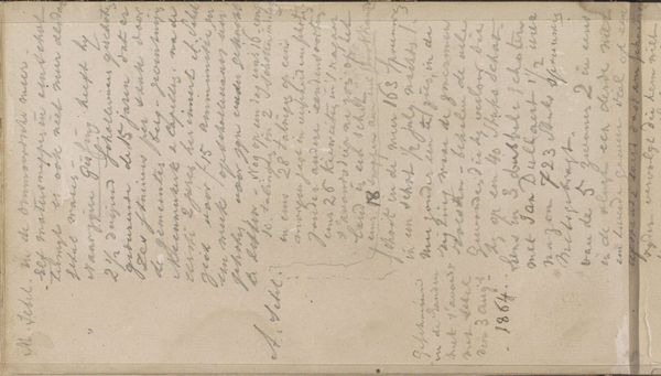
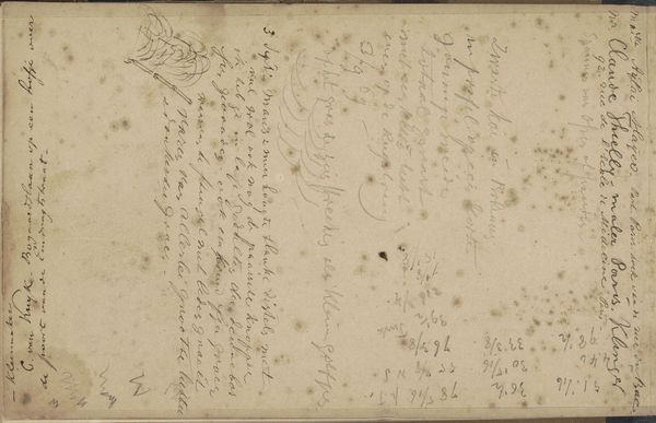
drawing, textile, paper, ink
#
drawing
#
toned paper
#
water colours
#
textile
#
paper
#
ink
#
coloured pencil
#
watercolor
Dimensions: height 10 cm, width 15.8 cm
Copyright: Rijks Museum: Open Domain
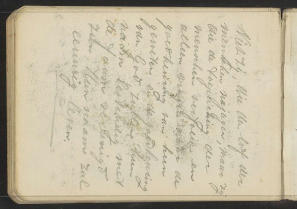
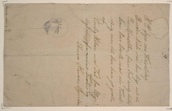
Curator: So, here we have a brochure from 1861 titled "Brochure for a Signalling Horn," a drawing rendered with ink and watercolor, with the artist listed as Edouard Dusauchoit. Editor: It's deceptively simple at first glance. Just this expanse of blue paper with some dark script. I am really intrigued by the colour, it immediately establishes a calm but also solemn tone. The text's placement also suggests that the paper might've been originally intended for a wider print run, leaving an emptiness which only emphasizes the message of the lettering. Curator: Agreed. And if we consider the materials, it really invites an interpretation beyond the visual. This was a working document, possibly a proof of concept. Think about the materiality of the paper itself—the social history embedded in its production. Who made it, and under what conditions? The creation and the reproduction of this pamphlet is the interesting thing. Editor: Right, but the pure forms! The script's calligraphic line contrasting with the flat, dyed colour. And consider the physical qualities! The paper is clearly toned, giving a wonderful, atmospheric base. Even that slight imperfection at the edges – these textural imperfections enrich the object! The composition strikes a delicate balance. Curator: Balance is a function of purpose, isn't it? This wasn't meant as high art. This brochure facilitated commerce, potentially maritime trade through the use of signal horns. It speaks to a specific time, place, and industry. Editor: I don't think the communicative purpose disqualifies an artwork! By analyzing how the elements—tone, texture, script—cohere, one reveals a structure. And from structure comes understanding of its message and inherent beauty, intended or not. Curator: True. There's something compelling in how function can shape the artistic endeavour in unexpected ways. Editor: Well, looking at it now I can see that this unassuming little flyer really gives plenty to think about with its subtle colours and its raw and minimal expression. Curator: Exactly. It’s a reminder that context and materials inform the visual and aesthetic value as much as artistic intention does.
Comments
No comments
Be the first to comment and join the conversation on the ultimate creative platform.
More like this