print, etching, engraving
#
dutch-golden-age
# print
#
etching
#
landscape
#
line
#
cityscape
#
engraving
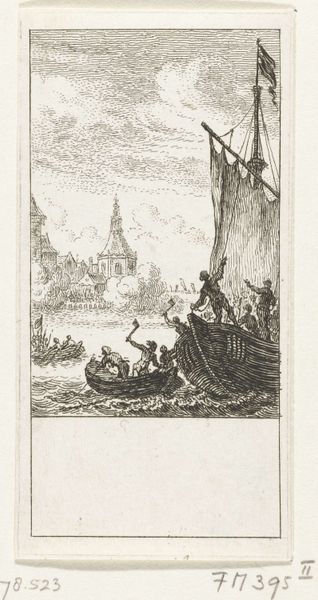
Dimensions: height 85 mm, width 55 mm
Copyright: Rijks Museum: Open Domain
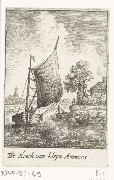
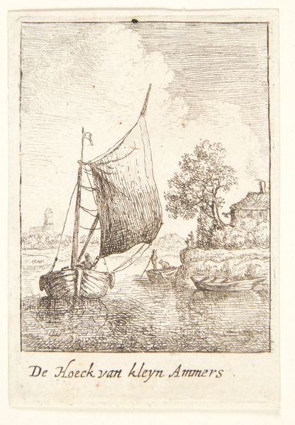
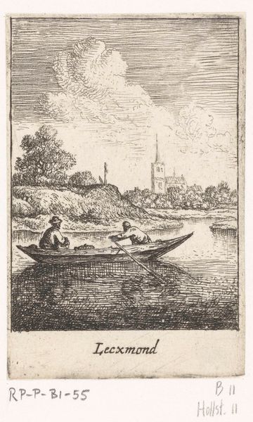
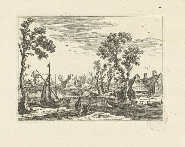
Curator: This etching before us is entitled "Gezicht op Lekkerkerk," or "View of Lekkerkerk," created by Jan van Almeloveen between 1662 and 1683. Editor: It’s wonderfully simple, but evokes such a clear sense of serenity. The subtle lines and minimal detail focus my attention on the quiet, reflective stillness of the water. Curator: Precisely. Almeloveen uses line—thin, consistent strokes—to build texture and spatial depth, consider the delicate cross-hatching to imply shadow and the careful rendering of reflections. The print rewards attentive observation of how form is constructed through strictly limited means. Editor: And yet, this "simplicity" belies a deeper story. The figures on the boat, perhaps conveying the day's yield toward town. I wonder what symbolic meaning the hay, the specific design of the boat, the steeple—and even those particular clouds—held for Almeloveen’s contemporaries? Curator: These details, considered through the lens of their formal arrangement, construct an implicit visual argument. Look, for example, at the subtle counterpoint set up by the church steeple in the distance, drawing your eye to the horizon, balancing the receding boat. These compositional elements point to more than simply documentation of daily life. Editor: Certainly. I'm also intrigued by the name "Lekkerkerk" which translates roughly to "Tasty Church" - was this a bit of wordplay suggesting some sort of commentary on the spiritual landscape, the river journey acting as some sort of metaphoric pilgrimage? Or might this be related to earlier symbolic depictions related to agriculture or waterways in Dutch art of the time? Curator: Well, without evidence, positing definitive symbolism borders on conjecture. What's more certain is how this artist modulates his marks and structures the composition of tonal areas so thoughtfully as to make us consider both subject and technique within one frame. Editor: True, true. Though I confess, I can't help but view the print through its historical, cultural lens, ever searching for buried codes. Curator: Fair enough. In the end, maybe the dialogue between strict form and expansive cultural inquiry simply reflects our different approaches… Editor: …leading, hopefully, to richer ways of understanding this small yet evocative glimpse into 17th century Holland.
Comments
No comments
Be the first to comment and join the conversation on the ultimate creative platform.
More like this