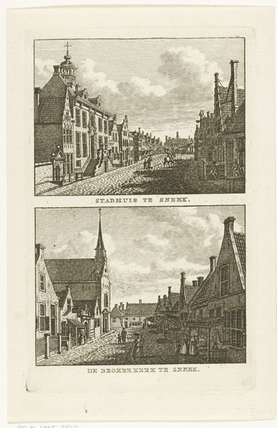
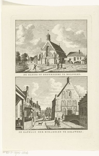
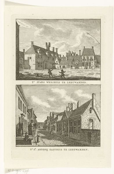
Twee stadsgezichten te Leeuwarden: Westerkerk en Armenhuis 1786 - 1792
0:00
0:00
carelfrederikibendorp
Rijksmuseum
print, engraving
#
neoclacissism
# print
#
landscape
#
cityscape
#
engraving
Dimensions: height 171 mm, width 107 mm
Copyright: Rijks Museum: Open Domain
Editor: Here we have Carel Frederik Bendorp's "Twee stadsgezichten te Leeuwarden: Westerkerk en Armenhuis," dating from around 1786-1792. It’s an engraving, a print. The meticulous lines and balanced composition give it such a calm, orderly feel. What elements jump out to you, observing it as an art historian? Curator: Focusing on the formal qualities, the parallelism of the composition immediately strikes me. Bendorp employs similar techniques in both the upper and lower registers, creating a diptych. The crisp linearity, achieved through the engraving technique, articulates a certain objectivity. Notice the interplay of light and shadow, creating depth without relying on heavy tonal contrast. Editor: So the clarity, almost scientific precision, isn’t accidental? Curator: Precisely. The rigorous composition, the structured recession into space... consider the delicate use of hatching to define form and texture. Do you see any echoes of Neoclassical ideals? Editor: I see how it shuns excessive ornamentation in favour of clear, rational design... There is an almost architectural focus! Curator: Precisely. The organization isn't random but relies on geometric structures and perspective. Reflect on how the structure dictates the viewer's attention; line by line we progress to observe the subject from a series of defined points. And from there can extract ideas and feelings based upon the structures themselves. Editor: I never considered the impact of just lines this way before. Thanks. Curator: And I you - our exchange clarifies Bendorp's commitment to order, symmetry and the clarity typical of Neoclassical expression in printmaking.
Comments
No comments
Be the first to comment and join the conversation on the ultimate creative platform.
More like this