Dimensions: height 354 mm, width 525 mm
Copyright: Rijks Museum: Open Domain
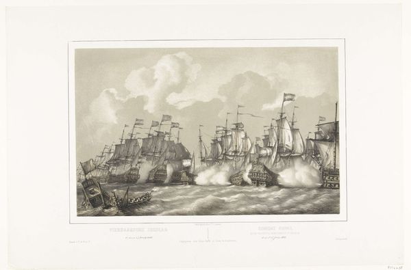
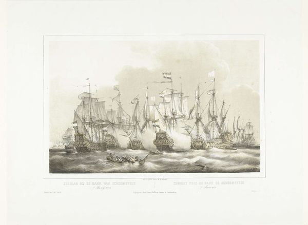
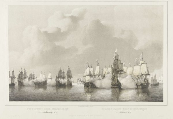
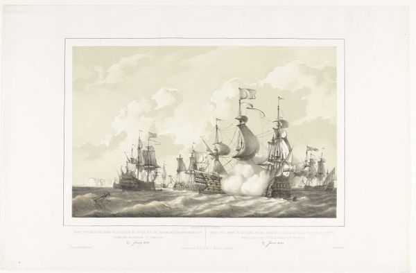
Editor: This etching, “De Tweedaagse Zeeslag, 1666,” by Petrus Johannes Schotel, was created between 1848 and 1855 and depicts a chaotic naval battle. I'm struck by the sheer density of ships and the billowing smoke; it’s incredibly dramatic. What do you see in this print, beyond the immediate representation? Curator: Immediately, I notice the meticulous attention Schotel gives to the articulation of forms, most especially in the rendering of the rigging and hulls. How does the composition direct our gaze? Do you notice any intentional contrasts? Editor: The ships overlap a lot, but there's also so much negative space between them, with masts reaching upward. And, of course, the black and white makes a sharp contrast. Curator: Precisely. It is through such contrasts—the verticality of the masts against the horizontality of the water, the solidity of the ships against the ethereality of the smoke—that Schotel generates visual interest. Observe also the light; notice how the bright highlights catch certain sails, directing our vision through the melee. What effect does this focused illumination have on the overall reading of the image? Editor: I see what you mean; the light seems to create a sense of depth, almost pulling us into the scene. It makes it seem much bigger. I hadn’t noticed that interplay before. Curator: The manipulation of light and shadow, form and void, are all meticulously calibrated to elicit a particular aesthetic response. In focusing our analysis on these intrinsic elements, we begin to decode the work's power, beyond merely documenting a historical event. Editor: So, focusing on composition reveals much more than just historical record. I appreciate understanding that more today.
Comments
No comments
Be the first to comment and join the conversation on the ultimate creative platform.
More like this