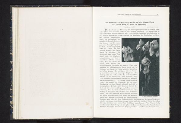
Dimensions: height 60 cm, width 45.5 cm
Copyright: Rijks Museum: Open Domain
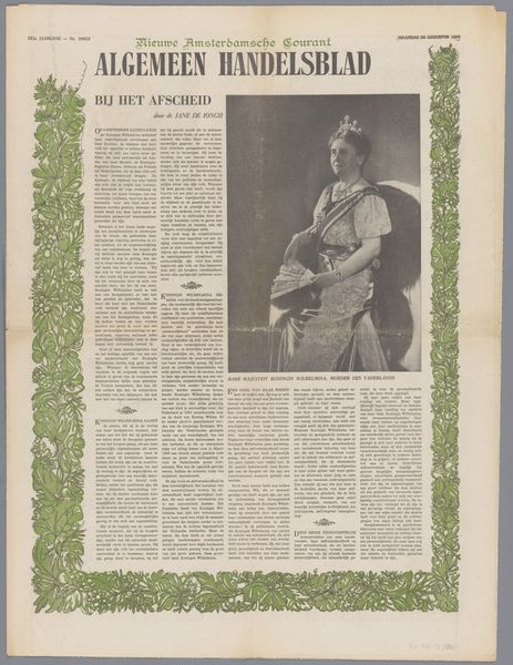
This is the Nieuwe Rotterdamse Courant from 1948. Newspapers are interesting because they’re so immediate, they capture a moment in time, but they’re also designed to be disposable, right? It’s a funny tension. The texture here isn’t just about the image; it's about the physical feel of the paper, the ink bleeding into the fibers, the way it might yellow and crumble with age. The grey scale flattens the image, reducing everything to a range of tones, which ironically gives it a kind of depth. Look at the way the headlines jump out, demanding your attention. They create a rhythm, a visual hierarchy that guides your eye across the page. It’s like a landscape, with peaks and valleys, areas of high and low density. You could spend hours tracing the movement of your eye across the page. Think about other artists who work with collage and found materials, like Kurt Schwitters, taking everyday ephemera and transforming it into something new. Art is a conversation and newspapers like this are part of that conversation, capturing the here and now, turning it into history.
Comments
No comments
Be the first to comment and join the conversation on the ultimate creative platform.
More like this