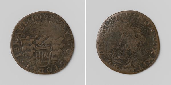
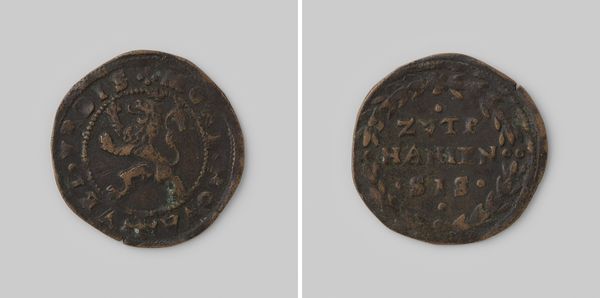
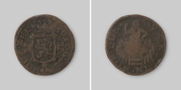
Dimensions: diameter 2.9 cm, weight 4.67 gr
Copyright: Rijks Museum: Open Domain
Editor: Here we have a “Rekenpenning uit Neurenberg met Meritrix,” a Nuremberg reckoning penny with the image of Meritrix. It was made between 1575 and 1625 by Hans Krauwinckel and is crafted from metal using engraving techniques. What first strikes me is the contrast between the detailed imagery and the coin's miniature scale. How do you approach a piece like this? Curator: Focusing on the visual elements, observe how the artist utilises line and form to convey complex allegorical imagery within such a restricted circular format. The density of the engraved lines creates texture and defines the figures. Consider how the composition leads your eye around the circumference of the coin. Note the placement of the text relative to the images. Is there a hierarchical structure? Editor: I see the text seems to frame the imagery, almost acting like a border. Do you think that enhances or detracts from the central images? Curator: That's a compelling question. Does the rigid structure and placement of text augment the impact of the symbolic representation or does it serve to distract from a purer visual reading? Further analysis might explore if the typography complements the artistic style to create a coherent overall piece. What are your thoughts on that juxtaposition? Editor: I hadn't considered the typography! Now that you mention it, I see how its formal quality supports the structure of the coin. Curator: Precisely. Now, how does an understanding of form inform your understanding of the possible meaning the artist tried to evoke? Editor: Paying closer attention to the relationships between the images and text has certainly given me a new appreciation for how to really ‘see’ and decode this artwork. Curator: Indeed; we must observe and investigate, because an artwork speaks through the organisation of its components.
Comments
No comments
Be the first to comment and join the conversation on the ultimate creative platform.
More like this