drawing, pencil
#
portrait
#
drawing
#
baroque
#
pencil sketch
#
group-portraits
#
pencil
#
academic-art
#
watercolor
Dimensions: height 267 mm, width 342 mm
Copyright: Rijks Museum: Open Domain
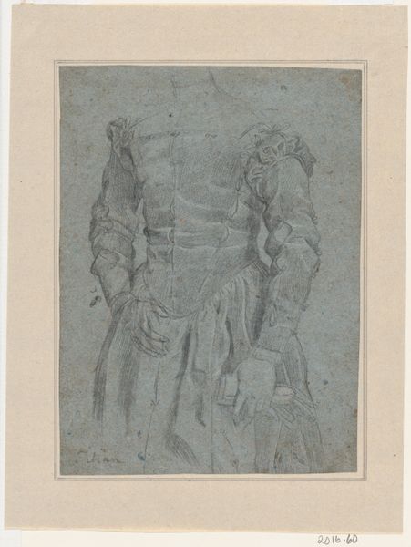
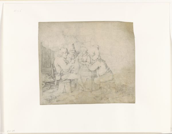
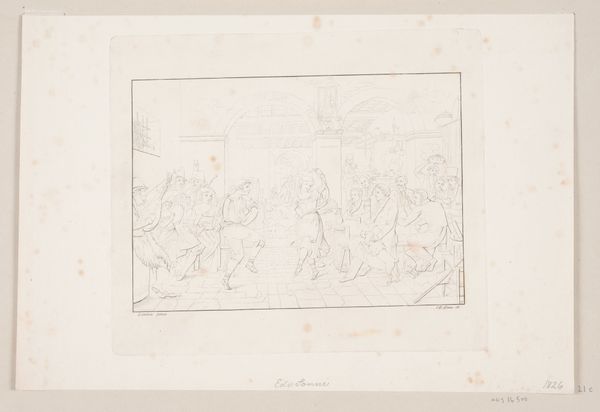
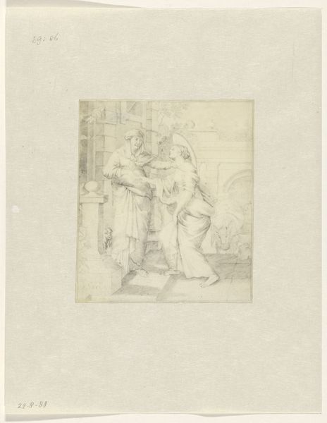
Curator: Here we have a piece entitled "Prinsengroep", created sometime between 1640 and 1660 by Martinus Lengele. It appears to be crafted with pencil, perhaps with some watercolor washes. Editor: It’s a sketch! The pencil work creates such a subdued and almost ghostly gathering. The subtle tones make it appear rather pensive and solemn. Curator: Yes, it's definitely a group portrait of some kind. Given the period, it's tempting to interpret this piece within the context of Dutch group portraiture, these commissioned paintings celebrated civic and military leadership, contributing to national identity during the Dutch Golden Age. Editor: The figures do seem arranged with intention. See how some figures are emphasized, with the placement directing the viewer’s gaze, which suggests careful structuring rather than mere documentation. Semiotics comes into play in how the arrangement signifies hierarchy, purpose and identity. Curator: The poses and dress offer significant insights. They’re dressed with specific indicators of class and probably rank, yet the sketch-like unfinished state might reveal some sort of underlying social critique. Consider too how baroque art infused drama into visual language – perhaps something subversive hides behind these faint lines. Editor: Or maybe it’s precisely this under-drawing that captures the elusive moment before social constraints take complete hold! The sketchy incompleteness becomes not a critique but an aesthetic choice reflecting transient observation of a certain social scene. Curator: That's an interesting consideration. Maybe it provides a liminal state. They exist almost in potential, not completely formed or cemented into historical narrative which perhaps lets the figures step away from prescriptive ideals of baroque authority. Editor: Incomplete form disrupting notions of power? Perhaps. But on a purely visual level the use of grey hues throughout adds this compelling unity and coherence making its formal qualities striking regardless! Curator: Thinking about those possible visual relationships across artistic conventions, historical frameworks, really encourages critical analysis on art and it challenges fixed interpretations. Editor: And I'm taken by how an analysis that foregrounds its artistic elements enriches rather than restricts the engagement!
Comments
No comments
Be the first to comment and join the conversation on the ultimate creative platform.
More like this