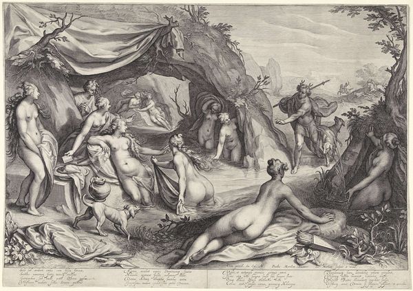
print, engraving
allegory
baroque
pen drawing
figuration
line
history-painting
northern-renaissance
engraving
Dimensions: height 282 mm, width 414 mm
Copyright: Rijks Museum: Open Domain
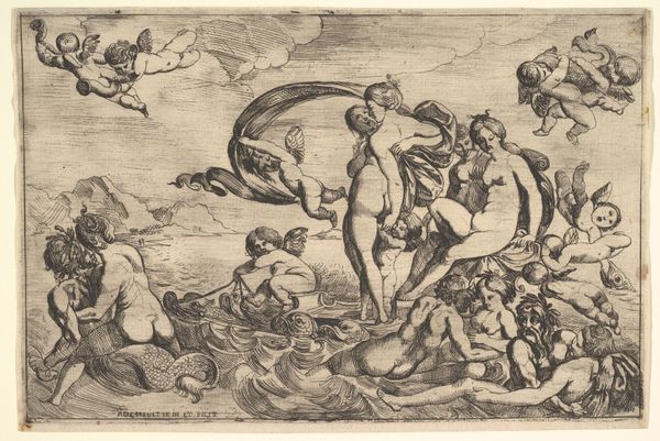
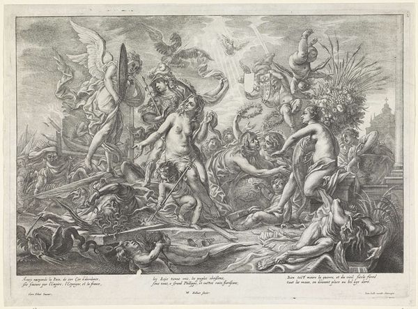
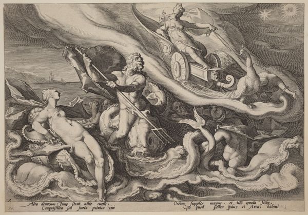
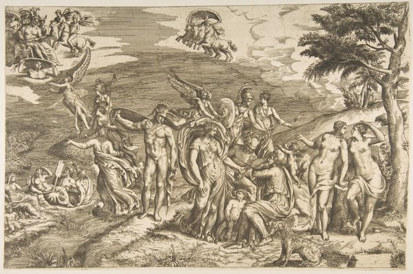
Curator: Welcome. Today, we will consider Jacob Matham’s engraving, “The Triumph of Neptune and Amphitrite,” created between 1611 and 1614. The original resides here at the Rijksmuseum. Editor: Ah, my first impression? Overwhelming. It’s a tidal wave of classical figures churning in a frothy sea. Feels very dramatic, operatic even, but busy, like everyone is fighting for attention in a school photo. Curator: The dynamism you perceive certainly comes from the composition. The artist uses the engraving technique, relying solely on the variations and density of line to communicate form, texture and light. We see the titular figures, Neptune and Amphitrite, in a central position, literally borne aloft. Editor: Right, and it's interesting how Matham rendered Neptune. He isn’t just a stoic god of the sea, he's got this almost bemused expression, as if even he is a little surprised at the sheer… commotion. It also reminds me of mannerism with its exaggerations of human forms. Curator: Note also the inclusion of Mercury above in the clouds, the cupids or putti sprinkling flowers from above, as well as the tritons, nereids, and sea monsters that accompany the central pair. It exemplifies Northern Mannerism, characterized by complex allegorical scenes filled with stylized, elongated figures and intricate detail, which served didactic purposes. The abundance signifies prosperity and dominion. Editor: But don’t you find the whole scene a bit...cold? For a celebration of marriage and dominion, everyone seems rather detached, like they are acting out roles in a very formal pageant rather than reveling in any true joy. Or maybe it's because the black and white doesn't allow for emotional nuances as in color. Curator: Perhaps, though consider this was an era captivated by the intellectual engagement with classical forms and complex symbolism; emotional displays weren't the primary concern. It’s an orderly construction intended to elevate. Editor: Perhaps so, I still get the sense that the artist packed every inch of the surface as much as he could, leaving very little negative space! Despite my initial reaction, I do appreciate the virtuosity of it all, especially given the limitations of engraving. Curator: Indeed. The artist’s deft hand created not just an artwork but a visual treatise on power, prosperity, and the enduring allure of classical themes in the Dutch Golden Age.
Comments
No comments
Be the first to comment and join the conversation on the ultimate creative platform.