acrylic-paint
#
pop art-esque
#
op-art
#
pop art
#
acrylic-paint
#
abstract
#
geometric pattern
#
bold defined shape
#
geometric
#
repetition of pattern
#
vertical pattern
#
pop art-influence
#
abstraction
#
pattern repetition
#
artificial colours
#
combined pattern
#
modernism
Copyright: Modern Artists: Artvee
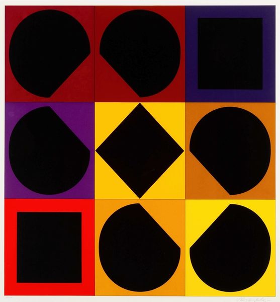
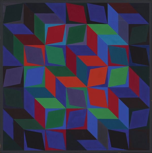
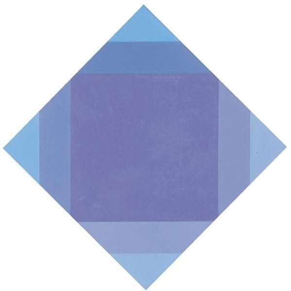
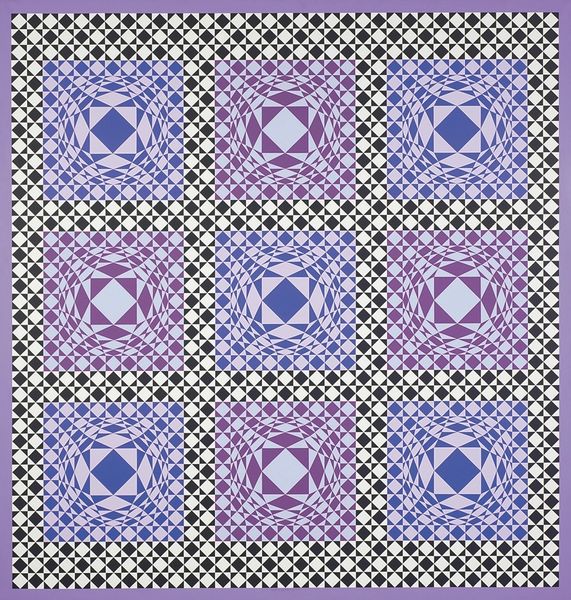
Victor Vasarely made ‘Topaze Noire – Negatif’ with paint, and a keen interest in geometry. Look how the colors are laid down in flat, unmodulated fields, really giving it that graphic, almost printed feel. The surface is so smooth, so considered, you can barely see the hand of the artist, yet this precision is what makes it so interesting, somehow. I love the way the black shapes seem to hover over the colored squares, creating this kind of push-pull effect. Note how the black diamond in the center casts a subtle shadow – this area, right in the middle, becomes this focal point, a mini drama played out with light and shadow. It reminds me a little of Josef Albers’ ‘Homage to the Square’ series, but with a much more playful, almost Op Art twist. Vasarely really understood how to make your eyes dance and question what you're seeing. It's all about visual sensation, and it definitely leaves you with more questions than answers, which is the point.
Comments
No comments
Be the first to comment and join the conversation on the ultimate creative platform.
More like this