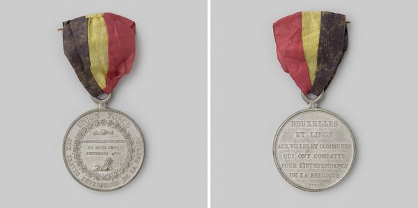
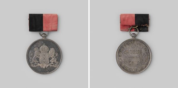
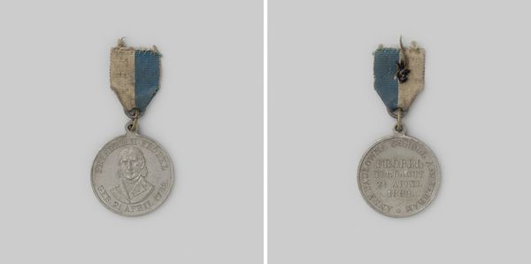
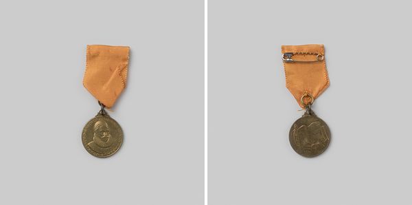
Septemberdagen te Brussel en Luik, ter ere van degenen die voor de onafhankelijkheid van het vaderland hebben gevochten 1830
0:00
0:00
metal
#
medal
#
metal
#
history-painting
#
academic-art
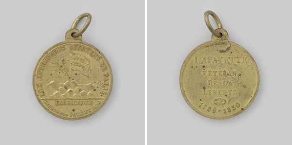
Dimensions: diameter 4.4 cm, diameter 3.3 cm, length 3.6 cm, weight 16.42 gr
Copyright: Rijks Museum: Open Domain
Editor: This is a medal from 1830 by Adrien Hippolyte Veyrat titled "September Days in Brussels and Liège, in Honor of Those Who Fought for the Independence of the Fatherland". It's metal and looks… celebratory, though aged. What do you see in this piece from a formal perspective? Curator: From a formalist standpoint, the interplay between text and image is critical. Note the careful arrangement of lettering, how it fills the circular space, contained yet also proclaiming. What effect does the circular form itself create, do you think? Editor: It seems like a container, like it’s trying to keep things preserved or commemorate a specific moment. Curator: Precisely. Consider too the lion motif. Its stylistic rendering, relatively simplified compared to, say, Romantic depictions of animals. It's positioned centrally but low, acting almost as a visual foundation for the text above. What does that compositional choice suggest? Editor: Maybe the text, the names of the fighters, is what's most important, while the lion represents Belgium? I mean, the ribbon also shows the Belgian flag's colors. Curator: A sharp observation about the heraldic aspect. The superimposition of text over a heraldic icon within a geometrically constrained space is remarkable. It invites us to think about the relationship between language, symbolism, and national identity. The symmetry reinforces balance and recalls classical composition methods, perhaps alluding to an orderly foundation for independence. Do you notice any contrast? Editor: I see the contrast with the slightly tattered ribbon. It looks very different from the metal. The ribbon also clashes with this feeling of classicism because it seems very frail compared to the enduring quality the medal is intended to embody. Curator: An interesting reading; so you see it more as a tension, almost an antithesis of temporality versus endurance, echoed in the clean lines of the type set. What final thoughts do you have? Editor: It seems less purely celebratory now and more complex, thinking about time and how nations create lasting symbols from fleeting moments of revolution.
Comments
No comments
Be the first to comment and join the conversation on the ultimate creative platform.
More like this