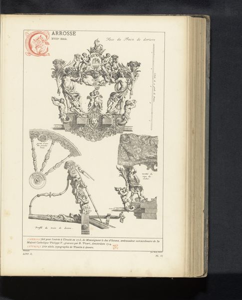
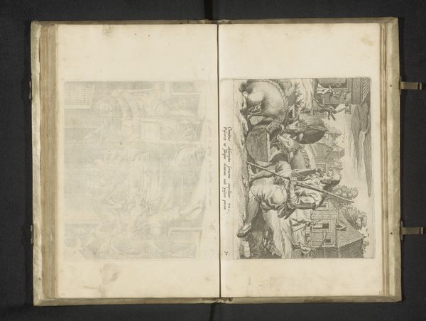
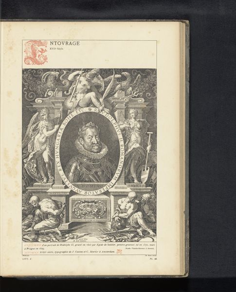
Reproductie van een ontwerp van een triomfwagen voor Ferdinand van Oostenrijk door Peter Paul Rubens before 1880
0:00
0:00
Dimensions: height 342 mm, width 231 mm
Copyright: Rijks Museum: Open Domain
Curator: This is a reproduction of a design for a triumphal chariot created by Peter Paul Rubens to honor Ferdinand of Austria. The print, appearing in an aged book, showcases the intricate detailing of the chariot design. Editor: Immediately, I'm struck by the density of the image. It’s incredibly detailed, isn’t it? The lines are fine, yet there's such a strong sense of baroque opulence and movement despite being static. Curator: Indeed. Rubens designed the chariot as part of celebrations around Ferdinand’s entry into Antwerp, so understanding the political climate is key. It embodies Habsburg power and legitimizes colonial exploitation, with subtle figures rendered almost incidental. Editor: From a formal perspective, note how the verticality is exaggerated by the flags and figures, directing our gaze upwards, enhancing that feeling of grandeur and celebration. And that intense shading giving volume and solidity to the figures despite the print’s flatness. Curator: Precisely, the placement of Habsburg symbols sends an unmistakable message of dominance during that time. Think about the indigenous populations impacted, as a single figure, trapped beneath that juggernaut. How does the chariot serve to broadcast Habsburg propaganda? Editor: Yet there is a certain elegance achieved with only linear precision. How those spiraling details achieve so much dynamic movement even in stillness is technically amazing. Each character, drape and pennant seems ready to come alive. Curator: Baroque art and absolutist authority often go hand in hand, presenting rulers and their empires in idealized, even bombastic terms. Consider the lasting impact, seeing those ideals today even? Editor: The careful deployment of contrast leads our eyes expertly through this composition to key areas and important iconographic motifs. A masterclass really on how to visually orchestrate a narrative of this magnitude using simply the line. Curator: Reflecting on the history allows for considering how this relates to cultural hegemony of today and questions the visual vocabularies still at work legitimizing power and authority now. Editor: Looking purely at line, light and the structured harmony created through formal organization makes it beautiful even while divorced of any contextual information, in and of itself.
Comments
No comments
Be the first to comment and join the conversation on the ultimate creative platform.
More like this